David Ahlund
Hi everyone - sorry, I'm new to this. I have read all the files and instructions I can find, but I don't quite understand how to actually change the skin. I have downloaded the skins' files and scripts. The files are (hopefully) where they should be, and I have the 3.3.2 beta - but how do I actually make it happen? I don't know anything about scripts and how they work. Thanks!
larserik
- David Ahlund wrote:
Hi everyone - sorry, I'm new to this. I have read all the files and instructions I can find, but I don't quite understand how to actually change the skin. I have downloaded the skins' files and scripts. The files are (hopefully) where they should be, and I have the 3.3.2 beta - but how do I actually make it happen? I don't know anything about scripts and how they work. Thanks!You download the beta and the skin installer and then you click the top right icon in Microtonic and select "Skin Chooser".
Latest beta is here: https://soniccharge.com/forum/topic/1922-microtonic-3-3-2-public-beta-update
larserik
I've made a pull request with my Silverbox skin. This is the first 1.0 version so it's working in all zoom levels.
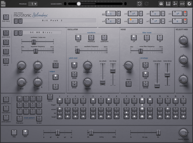
Talking about zoom levels, perhaps it’s obvious but this skin was made for a large UI size. Please zoom in as large as your screen resolution allows you to when using.
Ploki
shadows on the bottom sliders are cut.
i've noticed that template for sliders is misleading - it doesn't render the whole area of the PNG and cuts the sides off in both V and H slider pegs (top/bottom in H, sides in V)David Ahlund
You download the beta and the skin installer and then you click the top right icon in Microtonic and select "Skin Chooser".
Latest beta is here: https://soniccharge.com/forum/topic/1922-microtonic-3-3-2-public-beta-updateThanks so much for the quick reply, larserikJ! Wow - that first sentence was all I needed - and funny how I didn't find that info anywhere else, after all the searching and browsing. Your skin looks sweet, by the way! Big thanks again!
Magnus Lidström
- larserikJ wrote:
I've made a pull request with my Silverbox skin. This is the first 1.0 version so it's working in all zoom levels.😍 😍 😍
Now I want to make acid!
larserik
- Ploki wrote:
shadows on the bottom sliders are cut.Thanks for noticing, I've corrected my mistake and pushed the new version in my fork.
larserik
- Magnus Lidström wrote:
- larserikJ wrote:
😍 😍 😍
I've made a pull request with my Silverbox skin. This is the first 1.0 version so it's working in all zoom levels.
Now I want to make acid!
Manuel Senfft
Just beautiful. (=
Ploki
larserik
- Ploki wrote:
if anyone wants to give them a spin, Gin & Tonic and Flat versions.
https://we.tl/t-DniMuR4ro5Nice and fat. Good job.
You're tempo overlay graphics (tempo_x2.png) does not seem to be the correct files for both of your skins.
Ploki
Doh!
nice catch, will fix it :)
Fredrik Lidström
- Ploki wrote:
shadows on the bottom sliders are cut.
i've noticed that template for sliders is misleading - it doesn't render the whole area of the PNG and cuts the sides off in both V and H slider pegs (top/bottom in H, sides in V)Damn, I had not noticed that. I will fix that in the next Microtonic build so that it uses 30px instead of 24px for the slider caps.
Fredrik Lidström
@larserikJ Merged your pull request. Nice skin, love the piercing white lights!
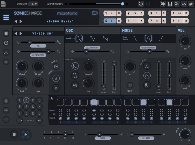
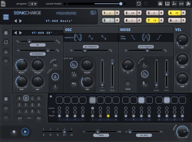
@Ploki Beautiful skin, I really like the indented black sections, like the waveform selectors. Let me know if you want help adding the Gin & Tonic skin to the skin repository.
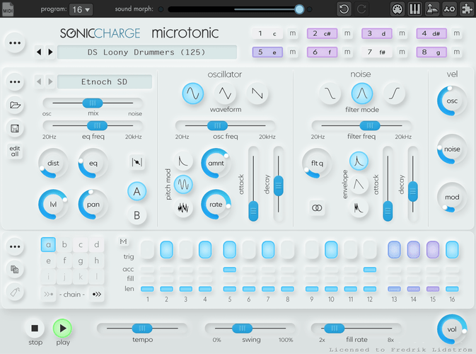
I've also completed the NeuTonic 🙄 skin I've been working on and pushed it to GitHub.
Peter L
Nice Skin Fredrik, all the flavour of the original tonic but with the taste of 2021. :-)
Ploki
Thanks @Fredrik, just a few more details (like the tempo thing) :)
also - nice skin! True neumorphic
Bru Franco
My new favorite skin, thank you Fredrik!
Manuel Senfft
Ploki and Fredrik: nice skins, wow! Very smooth. (=
Manuel Senfft
- Fredrik Lidström wrote:
@larserikJ Merged your pull request. Nice skin, love the piercing white lights!
@Ploki Beautiful skin, I really like the indented black sections, like the waveform selectors. Let me know if you want help adding the Gin & Tonic skin to the skin repository.
I've also completed the NeuTonic 🙄 skin I've been working on and pushed it to GitHub.I just realized: could it be that the pan graphics are not really centered? I mean the blue filling. When at zero position the little dot and the filling seem to be slightly left sided a bit. Or is it just me?
Fredrik Lidström
I just realized: could it be that the pan graphics are not really centered? I mean the blue filling. When at zero position the little dot and the filling seem to be slightly left sided a bit. Or is it just me?
No, you're right, it was a design choice to let the sliders go from the bottom and not at an angle. This means that it's not a full 360 rotation and that the center is not straight up. I didn't realize how bad that was for all knobs that have a mid-point. I'll see if I can tweak it by doing a non-linear animation, or if that's also weird. 😬
Manuel Senfft
Ah I see. Thanks for explaining. Well if it's just me, no need to change anything here. (-;
Fredrik Lidström
Pushed a non-linear "fix" where you get the centers straight up. Even tho it's a bit odd that the center point is not in the middle of the arc, I think it feels quite good.
Manuel Senfft
Ah, cool. Thx for the fix. I know what you mean. When fully turned up, the dot is not centered anymore, yes. But to me this looks totally ok and natural!
Ploki
i think i'm done :)
how do i get this to github?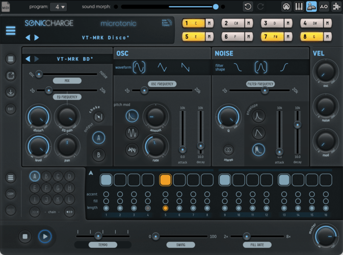
might do a couple of colour themes and dump them here, but i feel like this will be default.
edit:
Also still toying with flat variant :)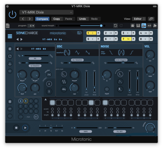
Fredrik Lidström
First of all, create a GitHub login and download a git client if you have not. Rest of the instructions here assume you're running the basic git command line tool.
- Go to https://github.com/fredli74/microtonic-skins
- Click the "Fork" button in the corner
- On your fork, click the "Code" button
- Copy the HTTPs clone URL shown, it should be something like
https://github.com/#yourname#/microtonic-skins - Clone the repository with
git clone #paste-url# - Step into the repository
cd microtonic-skins - Make your own branch
git branch MyAwesomeSkin - Change to your new branch
git checkout MyAwesomeSkin - Put your skin files in a new folder under
Microtonic Skins - Add your new files to your branch
git add "Microtonic Skins/*" - Commit your changes
git commit -m "Adding the MyAwesomeSkin Skin!" - Push your changes to your GitHub fork
git push - Go back to your GitHub page, switch branch from
mainto yourMyAwesomeSkinand check that your new files are up there and that it looks correct. - Go to the "Pull requests" tab and click the "New pull request" button
- Select
base repository: fredli74/microtonic-skins,base: mainas target and yourMyAwesomeSkinbranch as source. - Congratulations, you just graduated from the GirHub Forking Academy
Ploki
Before i make a pull request, I can't seem to switch from Main to Gin&Tonic branch - as there's no ginandtonic branch, it only sees main
Fredrik Lidström
Ah, my bad, I missed that you need to change branch after creating it. I have updated the post. You probably committed to main in your fork. Try doing a pull request from your main to my main, or restart and try again.
Magnus Lidström
I will never understand git. 🥸
I think the skins are super Ploki. I would be happy to include one or both of them in the final official version of the skin installer.
Ploki
woo thanks :)
The flat one still needs some tweaking, but i'll have it ready soon.
Ploki
i think i managed to commit tempo 2x to my main?
or should i remove everything and make a new branch? How do i even remove it :DPloki
Decided to dive a bit deeper into the flat theme :) Still a spin off of the original as far as shapes go, but sportier color scheme and simplified shapes that go better with the flat aesthetic
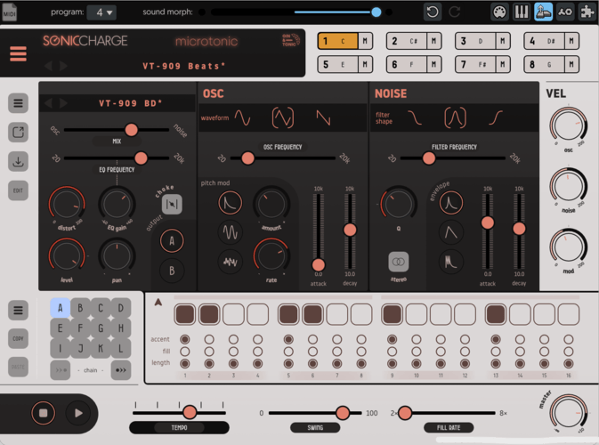
Manuel Senfft
Wow, nice skins, Ploki! I like the first flat theme more than the one with the black/white-ish touch ... while maybe it is a matter of "getting used to it"? It's not bad after all. It's ... interesting, hehe! (=
Magnus Lidström
- Ploki wrote:
Decided to dive a bit deeper into the flat theme :) Still a spin off of the original as far as shapes go, but sportier color scheme and simplified shapes that go better with the flat aesthetic😎👍
The colors are cool and I appreciate that it looks more different from the 3D Gin & Tonic.
(Damn, I got a craving for a good gin & tonic now.)
Ploki
@Magnus: haha :D
@Manual: Thanks :) yeah since the original 3D tonic is pretty uniform, i figured I could mix it up with the flatter variant. Somehow i feel like the flatter variant feels more vintage
if someone wishes to give it a spin before I push it to git :)
https://we.tl/t-LKZotr1MXe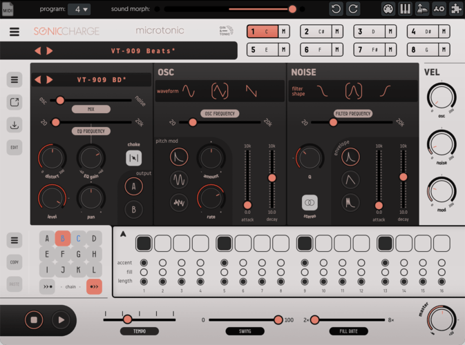
JBDS1
Hy Ploki , can you do a grey flat version like this?
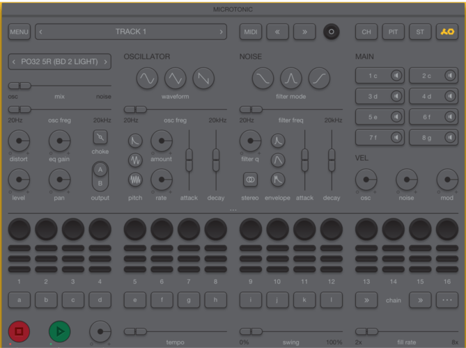
https://dribbble.com/shots/3628972-Microtonic-redesign/attachments/810320thank you :)
JBDS1
Ploki ,, regarding to your last skin i would do something like this ..
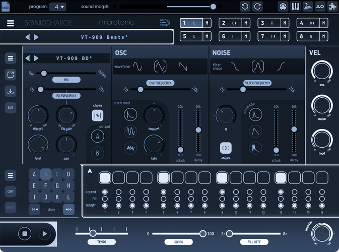
Desaturate, invert, hueManuel Senfft
Nice one! Totally excited to test these new skins later then, hehe. (=
Also thanks for sharing!Ploki
i'll take a look at it :)
Ploki
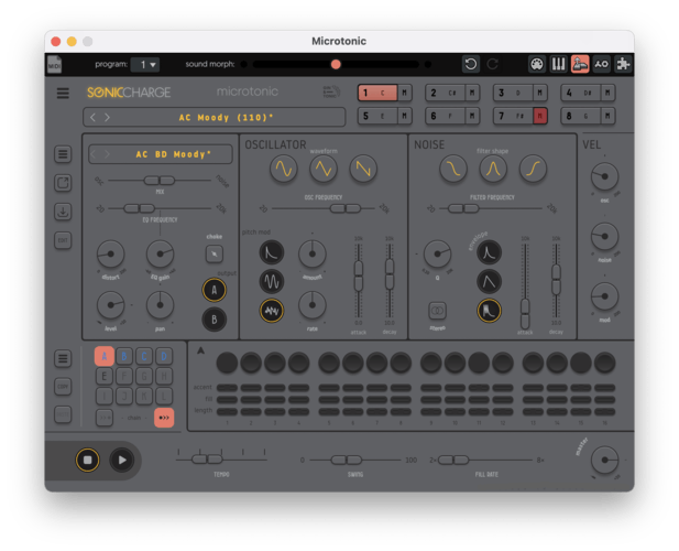
I suppose it's easy enough to make this one work :)
need to credit the original author tho.JBDS1
- Ploki wrote:
I suppose it's easy enough to make this one work :)
need to credit the original author tho.Bro it looks so super nice !!!!!
Can i have it? plsssssPloki
sure i'll upload it as soon as its done :)
Markus
- Ploki wrote:
I suppose it's easy enough to make this one work :)
need to credit the original author tho.@Ploki: Looks really great! Smooth, clean, fresh, inspiring... Complete new Microtonic feeling :)
groooveq
nothing to say except these are all gorgeous, µTonic never LOOKED and sounded so SEXAY!
JBDS1
- Ploki wrote:
sure i'll upload it as soon as its done :)Thank You So Much !!! You are the Greatest !!
Ploki
i couldn't do everything the same as Dmitry Nikonov's concept because I'm constrained by Microtonic's framework, but i guess it's close enough :)
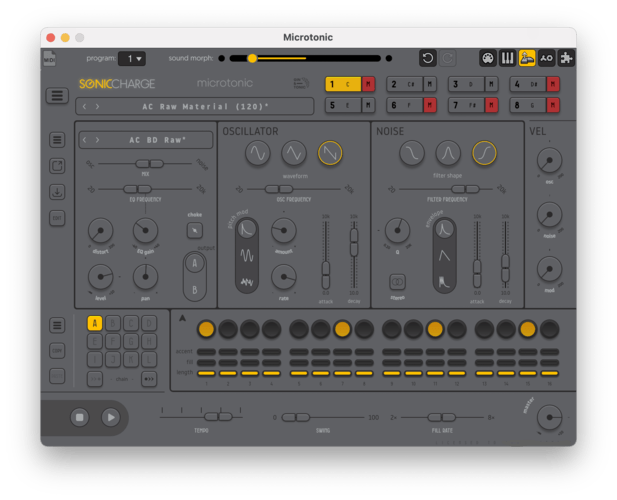
JBDS1
- Ploki wrote:
https://we.tl/t-wyMe1lOhTQ
i couldn't do everything the same as Dmitry Nikonov's concept because I'm constrained by Microtonic's framework, but i guess it's close enough :)Dudeee .. It ABSOLUTLY ----- PERFECT PERFECT PERFECT !!!! LUV IT !!! Thank you so much 4 this !!!!!!
Magnus Lidström
- Ploki wrote:
https://we.tl/t-wyMe1lOhTQ
i couldn't do everything the same as Dmitry Nikonov's concept because I'm constrained by Microtonic's framework, but i guess it's close enough :)Damn you're quick. Love it! Goes perfectly with the PO-32. I remember seeing that post by Nikonov Dmitry some years ago. Did you manage to reach out to him to show what you did?
With the rate that new quality skins drop here, I will soon have to improve the SkinChooser so it shows more than one page of choices. (Alt. scrolling, but that is more work.)
Ploki
:D
I have everything in the affinity document setup with dynamic links - gfx and color scheme, and exports with correct names so it's really quick to make changesI'll contact Dmitry :)
There's an issue with the Dmitry's skin in the matrix - forgot about the matrix. I'll fix it. I suppose I can make branches for both GinTonic Flat and GinTonic-Dmitry on git?
edit: fix
https://we.tl/t-D9lYwuhq7mFredrik Lidström
Damn, is that in Affinity Designer? Maybe I should step out of my Adobe shoes and see what the world has to offer. 🙂
Yeah, you can make a branch for each skin, or throw them into the same branch, it just depends on how you want to work with it on your end. The benefit of different branches is if you work with them in parallel and only want to make a pull request on one of them.
JBDS1
Ploki i made an update to your update.. i hope you don't mind.. i just the look that i want ... I know i sad yours it perfect ..but it like this colors better :) Thank you again !!!
https://we.tl/t-W7JuggoLQsPloki
@Fredrik: Affinity Designer yes :)
I find it faster than illustrator. It has a few quirks here and there, but i'm not missing adobe at all.@Ionut Chiran: not at all! Looks good - i might pick up the colors and fonts from your version before going to github :)
JBDS1
This version it solid ..the other one has some words missed ..sorry for that :)
https://we.tl/t-siRzWsEGzAelectronic drum
Thanks so much LarsErik, Ploki and Fredrik for all these beautiful new skins!
@Magnus: I think having the skin chooser showing more than one page would be better (i. e. more convenient) than a scrolling down option.
@Ploki: G&T is amazing. Since you asked, I liked the first version ogf the G&T Flat skin best (the dark one), but I understand that you want to go for something different (and it still looks gorgeous anyway). Thank you for finally turning Dmitry Nikonov's concept into an actual skin (and thanks to Ionut Chiran for suggesting this).
@Fredrik: Absolutely love NeuTonic. Fantastic!
@Lars Erik: Silverbox looks so clean and professional - wow!
BTW: In the tonicA skin, the word "length" has been misspelled.Ploki
Thank you! :)
re darker flat G&T: I'll probably dump a few additiional color schemes here on the forums, to not flood the skin selector :D
Ploki
experimenting with a more futuristic side-light look. :)
I'll upload GT Flat and Dmitry's concept to git first before I wade in too deep into this lol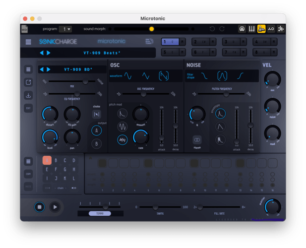
Manuel Senfft
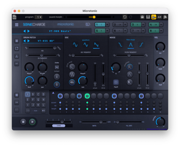
This looks nice, too. While The pattern numbers and the step sequencer are hard to watch at. The patterns could need more seperating lines or so and the step sequencer needs way more cotrast, I guess.
Ploki
Absolutely - i haven't worked on the bottom part yet :)
larserik
- electronic drum wrote:
Thanks so much LarsErik, Ploki and Fredrik for all these beautiful new skins!>
@Lars Erik: Silverbox looks so clean and professional - wow!
BTW: In the tonicA skin, the word "length" has been misspelled.Thanks, happy to hear you like it.
I've got some bugfixes for the Silverbox on the way so I will make sure to also fix the spelling on the tonica. Thanks for noticing.
Ploki
more like this
JBDS1
Hey Ploki, modified your microtonic skin again and i made a Tron Legacy version, what do you think ??? :)
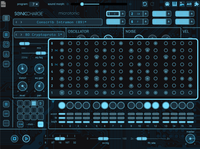
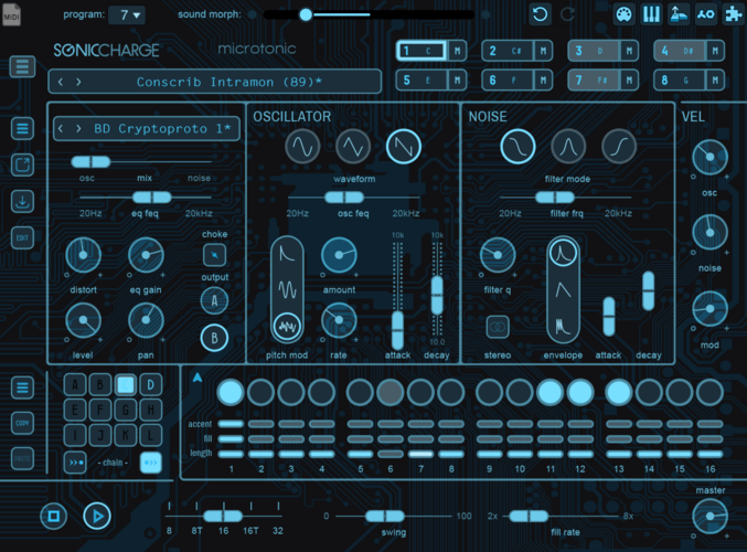
here it the skin
https://we.tl/t-4AcnL38ehv
You need to be signed in to post a reply
