slava meseka
hi guys! how can I install a new skin on my Microtonic without Microtonic Skins dmg file ??? Because downloading is restricted and I don't know where to take it/// help plz!
AAV
Philter - thanks for sharing these. I tried Blues Brothers and ESX1. Both are really nice though I am partial to Blues Brothers right now. Nice combination of colours and lightness/Darkness. Very nice work. Thank you and much appreciated.
larserik
Nice work philter. Thanks for sharing, I like the scatched up bluesbrother the best.
Karschnackelwackel
Great skins, guys! I am using darkone, but would love to have a bright one that is really smooth looking. The bright ones so far didnt impress me so much.
larserik
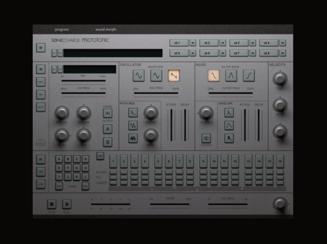
I've started work on a new skin. Aiming for some soft pushbuttons and Oberheim-Sem-ish metal backplate. Still a log way to go, might end up somewhere else..
Christian F.
This looks fantastic!
Karschnackelwackel
indeed, very cool skin!
larserik
- Christian F. wrote:
This looks fantastic!- Karschnackelwackel wrote:
indeed, very cool skin!Thank you guys, but I've come to a dead end with this skin.
Fredrik Lidström
Too bad, it looks sweet!
AAV
Fredrik- I have used several skins (including one of Larserik's excellent (Darkone) skins. In the end though I keep coming back to the factory default skin, which offers a great balance of clarity and function. Really a great skin. The one thing I would request (and I might be the only one) is for an easy way for a dummy like myself to change colours on the factory skin. What I would consider perfect would be numeric entries for text, foreground and background (I'll show my age and reference the method that was used in Daiichi Synth 1 for those old enough to remember that). I understand that there is a huge appeal to creating and having photorealistic skins and would not want to discourage that capability. I just would like the option to "tweak" some colours in an easy way when the mood strikes. When you guys have nothing else to do.....😉😁
larserik
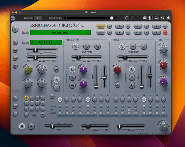
tonicA mk2 with more color, upgraded panel lines and dark faders.
AAV
That's really nice Larserik! Excellent job as always!
larserik
thanks, if you want to try it out it's available here:
https://l4rs3rik.github.io/microtonic/AAV
Thanks I will definitely do so! Awesome Larserik!
Fredrik Lidström
ha, nice one. I see you worked your way around the one-knob-animation problem. 😊
Fredrik Lidström
- AAV wrote:
Fredrik- I have used several skins (including one of Larserik's excellent (Darkone) skins. In the end though I keep coming back to the factory default skin, which offers a great balance of clarity and function.Thanks AAV. There's been a lot of opinions about the default skin over the years. I've kept tweaking it and improving it but trying to stay with the same layout and estetics. Some love it, some hate it. Which is why the alternative skins are a great addition.
- AAV wrote:
I just would like the option to "tweak" some colours in an easy way when the mood strikes. When you guys have nothing else to do.....A color theme function inside the plug-in would be cool, but as you mentioned, it would need to use more vector and less photorealism. It's possible to tweak and colorize the original images and make additional skins. I suppose one of the easiest ways is to do hue/saturation with colorize in Photoshop and macro it to run the same adjustment on all png files.
larserik
- Fredrik Lidström wrote:
ha, nice one. I see you worked your way around the one-knob-animation problem. 😊Yes.. I had this heap of renders from yesteryear laying around so this was fun to try out.
AAV
Hey Larserik! I loaded up your TonicA mk2 skin. It's really a thing of beauty, like a whole new plugin. I find the balance between the metallic "instrument" itself and the colour elements (knobs, led's) to be just right. Really great work! Thanks for sharing!
larserik
- AAV wrote:
Hey Larserik! I loaded up your TonicA mk2 skin. It's really a thing of beauty, like a whole new plugin. I find the balance between the metallic "instrument" itself and the colour elements (knobs, led's) to be just right. Really great work! Thanks for sharing!Good to hear that you like it, I'm quite happy with it myself. Brings a more accented look and "feel" to the UI compared to the first version imho.
philter
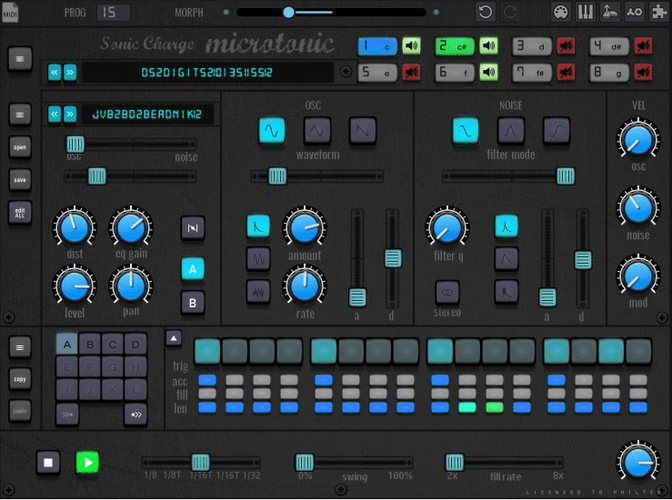
small preview of my blues brothers skin v2, what do you guys think so far?
c0nsilience
It looks great! 😊
philter
- c0nsilience wrote:
It looks great! 😊thx mate!
critism, suggestions or other ideas are always welcome! i know it´s hard to really see the skin in action with only a screenshot, therefor i will upload this unfinished version later and see what you think of the skin in "action", so that the finished version can follow asap.BTW: i am working on a complete "create-your-own-microtonic-skin" solution that contains a pack of Knobman files that are tailored to create new custom microtonic skins or edit/modify/change existing ones as easy as possible. this means EVERY microtonic GUI element (or it´s related image file in the microtonic skins folder) has it´s own knobman file, preconfigured in the correct size ,with the correct number of steps and some preset layers and also a pre-loaded image strip with the specific GUI Element from the default legacy skin.
importing knobs or switches, like e.g. from the knobman gallery (https://www.g200kg.com/en/webknobman/gallery.php) or from your favourite VST plugins skin folder is pretty easy, even GIF animations or animation sprites can be used.
you can create value readout displays or labels in ANY installed font, add shadows and lighting
to your GUI element, change the size, the position or other values like hue, transparency or contrast. you can also define multiple custom value curves to create non-linear changes of (almost) every graphic parameter. i will also include a small tutorial with some pretty nice tips,tricks and examples when it comes to knobman. this isn´t something for the skin pros here
(and we all know that we have some damn good graphic experts and skin creators here in the forum), it´s more targeted to microtonic users that want to create their own skin without investing too much time or going down the knowledge rabbit hole. what do you guys think of this idea?so, enough said now, excuse my weird post, i think it is time to take some sleep ;)
greetings from germanyAAV
Hi Philter. That all sounds great. I look forward to trying out the skin. It looks great. Any utilities/tools that can facilitate making/adapting skins easily is a great idea in my book. Sometimes it's more about colour and functionality, and can change with my mood. Though I agree some of the skins produced are true works of art, they are beyond my skill to do.
philter
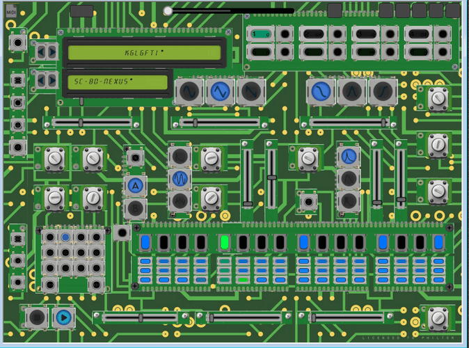
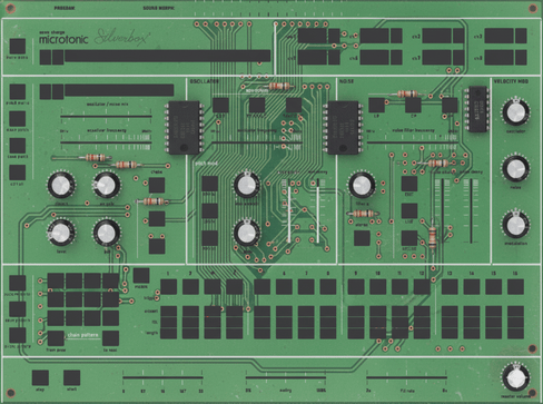
work in progress, PO-32 inspired skin
blues brothers 1 skin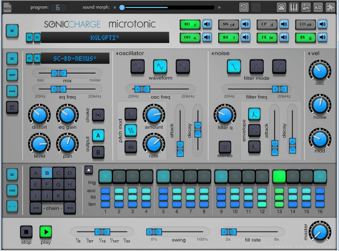
blues brothers 2 skin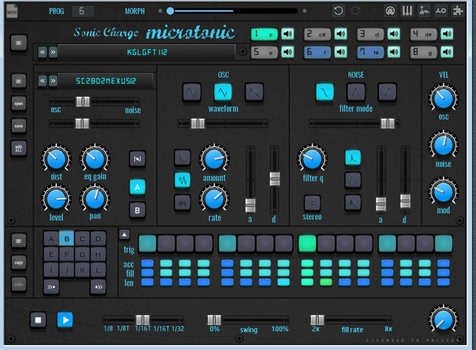
retrospective skin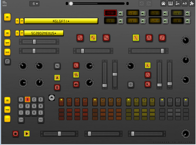
Magnus Lidström
Ha, that PO-32 skin looks fun! 👍
philter
- Magnus Lidström wrote:
Ha, that PO-32 skin looks fun! 👍thx, hope you like it!
Jan Vandeweyer
sweet :) I like the circuit board
larserik
- philter wrote:
work in progressLove the circuit board one. Good work.
philter
small teaser of what´s coming in 2026 ;)
(click image to see the GIF animation)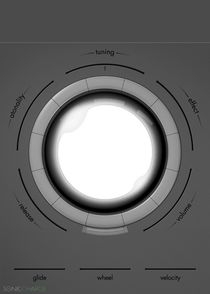
Fredrik Lidström
Holy sh* wow! There are some crazy designs in there. 😁
Jan Vandeweyer
That's wicked philter ;) Are you working together with Fredrik Lidström to integrate them in synplant and microtonic?
philter
i will share them once they are finished. problem is they are all slightly misaligned or have other issues that i have to fix before i can share them. i trained a custom gemini ai app to create all the skins and i hope that i can share this app also once all the issues are fixed. i have also created a lot of knob animations and switches and so on, and i will keep you updated about the progress. thanks for the feedback guys
JBDS1
The the circuit board It FIRE !!!
Magnus Lidström
This looks awesome philter. Can't wait! Curious about the app too.
philter
- Magnus Lidström wrote:
This looks awesome philter. Can't wait! Curious about the app too.i will send you a private link to the beta version of the app and to my google drive with all the knob animations if you like. i am very happy to get this feedback, especially from you the developers. but i also appreciate the feedback from all the other guys , too.
larserik
Looks like I have a couple of percent of my designs and work in your upcoming skins. :D
There's a lot of cool designs and fun things in your gif previews. Would love to try some out when they are ready and if you want to share more information about and insights about your Gemini workflow would be interesting.
philter
- larserik wrote:
Looks like I have a couple of percent of my designs and work in your upcoming skins. :Dyeah absolutely! i mean almost all the skins in the gif previews are (obviously )either created as a variation of the legacy skin background OR the background of one of the other beauties that you have created! as mentioned it is all still work in progess and nowhere near perfect or ready to release or share publicly, but for me it was always clear that once they were readyy and i want to publish them, that i would ask you for permission first before releasing anything that is based on your work.
if you message me a email adress or another way to contact you private, i will send you
a private link and instructions to the apps i´ve created with google ai studio. and a private link to a folder in my google drive which contains all the skin related images i allready made.and in case you are not only interested in the gemini workflow, but also want to participate in vibecoding and further developing the apps, i could also send you a private link the the gemini build workflow itself inside google ai studio and give you advanced permissions
philter
@ larserik and @ Magnus Lidström :
i´ve just signed up a github account and started following you. you can contact me there, snd i can send you the links .. main reason i signed up was because i just found out i need to deploy the ai apps i made first to safely share and maintain them later ("deploying and maintaining" something are both also completely new things to me...like so many things in the programmer/developer world), , . tbh, i´have never used github before but it seems i have to get familiar with the way it works,philter
just a question to all users, out of curiosity:
What would be YOUR favourite style/theme for a Microtonic Skin?
larserik
@philter thanks, but I'll pass on your offer to dive into Gemini app.
About the designs, I think the circuit board designs are interesting as a concept for Microtonic.
You need to be signed in to post a reply