Sjoerd van Geffen
Just dropping a tiny clue here....
electronic drum
- LarsErik wrote:
- electronic drum wrote:
That was very specific. :D
Hi LarsErik,
just like your Tonic Dark skin, this one looks fantastic, too!!! Thanks so much for your work and for sharing!
May I, however, make a few suggestions?
I've read what you've written and I understand your concerns but at the end of the day I'm not going to take specific requests. I have an idea in my mind what I want for myself and I'll keep going moving pixels around until I get close enough or I give up, whatever happens first.I just wanted to give some feedback in my first point (the others were indeed "wishes") .The Tonic Dark skin is the one I am using at the moment (looks great). I am looking forward to Tonic Silver. Thanks for your creative work! Keep on going, do not give up! :-)
electronic drum
- Sjoerd van Geffen wrote:
inprintcharacters_x2.png.zip(3.85kB, 1557 downloads)3) Could you, please, provide an alternative without the tape strip in the bottom right corner (where it says "Licensed to ...")? I know this is a matter of taste, but maybe as an additional alternative ....
For any Microtonic v3.3 skin (including the default one): if you replace the fileinprintcharacters_x2.pngwith a fully transparent image then you won't see the licensee name. I've attached one for your convenience.Sorry, I think you got me wrong: I am absolutely fine with the licensee name, I din't want to get rid of that. My wish was for a version without the tape strip as displayed in LarsEriks draft. But thank you for that hint, anyway!
electronic drum
- Sjoerd van Geffen wrote:
Just dropping a tiny clue here....Looks promising! :-)
larserik
- electronic drum wrote:
- LarsErik wrote:
I just wanted to give some feedback in my first point (the others were indeed "wishes") .The Tonic Dark skin is the one I am using at the moment (looks great). I am looking forward to Tonic Silver. Thanks for your creative work! Keep on going, do not give up! :-)- electronic drum wrote:
That was very specific. :D
Hi LarsErik,
just like your Tonic Dark skin, this one looks fantastic, too!!! Thanks so much for your work and for sharing!
May I, however, make a few suggestions?
I've read what you've written and I understand your concerns but at the end of the day I'm not going to take specific requests. I have an idea in my mind what I want for myself and I'll keep going moving pixels around until I get close enough or I give up, whatever happens first.Ok cool, I get that. Thank you for clarifying.
Jose Velez
- LarsErik wrote:
Here's a preview of my "tonic silver" skin that I'm working on.Absolutely Stunning!! I'm running the dark mode skin you made. Looking forward to the completion of the "Tonic Silver" Skin.
larserik
Tonic Silver skin is now done if you want to try it out.
Download is on my github here: https://l4rs3rik.github.io/microtonic/

Olli Treiber
- LarsErik wrote:
Tonic Silver skin is now done if you want to try it out.
Download is on my github here: https://l4rs3rik.github.io/microtonic/
Thank you for your wonderful work.this is perfect.big thanks :-)
Magnus Lidström
- LarsErik wrote:
Tonic Silver skin is now done if you want to try it out.
Download is on my github here: https://l4rs3rik.github.io/microtonic/
Now this is my favorite so far. Amazing work! I just posted to my Instagram story https://www.instagram.com/soniccharge/
The pattern buttons behave a little odd. After you've played a pattern it leaves the button green. But maybe this is by design?
larserik
- Magnus Lidström wrote:
- LarsErik wrote:
Tonic Silver skin is now done if you want to try it out.
Download is on my github here: https://l4rs3rik.github.io/microtonic/Now this is my favorite so far. Amazing work! I just posted to my Instagram story https://www.instagram.com/soniccharge/
The pattern buttons behave a little odd. After you've played a pattern it leaves the button green. But maybe this is by design?Thank you, most kind.
The pattern buttons staying green was an error on my side. I've corrected that now. (Same download but improved content in the zip.)
larserik
- Olli Treiber wrote:
- LarsErik wrote:
Tonic Silver skin is now done if you want to try it out.
Download is on my github here: https://l4rs3rik.github.io/microtonic/Thank you for your wonderful work.this is perfect.big thanks :-)
You're welcome.
Manuel Senfft
Wow, really nice. I still like your darker skin a bit more, but both are really beautiful an dpleasing for the eyes!
Just one little bug, I guess: when chosing a drum patch and playing this drum patch, the patch-button won't stay white. In the vintage skin the little red dot stays red, even after playing this drum pattern. In your skins the buttons blend out to its original state, like no drum patch is selected in the end.
I am not sure if it gets clear in this GIF:

Nevertheless: thank you again. Great work! (=
Christian F.
^ It's the same with the pattern-select buttons.
Also nevertheless thank you so much LarsErik!!!
I guess you're a celebrity now:
https://www.synthanatomy.com/2021/01/soniccharge-microtonic-two-free-beautiful-skins-you-shouldnt-miss.htmllarserik
- Manuel Senfft wrote:
Just one little bug, I guess: when chosing a drum patch and playing this drum patch, the patch-button won't stay white. In the vintage skin the little red dot stays red, even after playing this drum pattern. In your skins the buttons blend out to its original state, like no drum patch is selected in the end.Thank you for your feedback.
I did this by design. Wanted the buttons to be "quiet" when nothing is begin played back, so that's why I let the button go back to it's "off" state. Regarding the colors the idea was that white should indicate click/select, red is playback on the currently selected channel and green is playback on the non-selected channels. But I get your point of view that this is different and perhaps not as good as the vintage skin.
larserik
- Christian F. wrote:
I guess you're a celebrity now:
https://www.synthanatomy.com/2021/01/soniccharge-microtonic-two-free-beautiful-skins-you-shouldnt-miss.htmlYes, it's official, I'm a celebrity now. Just this morning the swedish king called and congratulated me on my achievements volunteering in the pixel pushing industry.
Manuel Senfft
- LarsErik wrote:
I did this by design. Wanted the buttons to be "quiet" when nothing is begin played back, so that's why I let the button go back to it's "off" state. Regarding the colors the idea was that white should indicate click/select, red is playback on the currently selected channel and green is playback on the non-selected channels. But I get your point of view that this is different and perhaps not as good as the vintage skin.Ah, I see and I do understand that. Still a cool skin I'll use, hehe! (=
- LarsErik wrote:
Yes, it's official, I'm a celebrity now. Just this morning the swedish king called and congratulated me on my achievements volunteering in the pixel pushing industry.Niceeeee! d-:
Dave Ashford
- LarsErik wrote:
Tonic Silver skin is now done if you want to try it out.
Download is on my github here: https://l4rs3rik.github.io/microtonic/
Thanks, looks amazing, even better than the dark one! :)
Dave Ashford
I wonder what will happen at Easter? (the step buttons usually turn into coloured eggs during Easter week).
Magnus Lidström
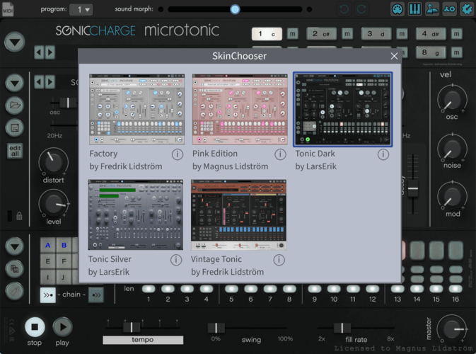
It would be sweet to have an easy-to-use skin chooser. There are three good-looking alternative skins already. Unfortunately I cannot accomplish this with a script only. The
Microtonic V3.3 Resources Path.txtresides in a folder that has write access restrictions, both on Mac and PC. I need to come up with a better solution for the next Microtonic update. 🤔larserik
- Dave Ashford wrote:
- LarsErik wrote:
Thanks, looks amazing, even better than the dark one! :)
Tonic Silver skin is now done if you want to try it out.Thanks! Yes I agree the silver one turned out way better.
- Dave Ashford wrote:
I wonder what will happen at Easter? (the step buttons usually turn into coloured eggs during Easter week).Oh it won't be pretty. :D
electronic drum
Wow, the Tonic Silver skin is absolutely stunning!!! Thanks so much!!!
larserik
- electronic drum wrote:
Wow, the Tonic Silver skin is absolutely stunning!!! Thanks so much!!!You're welcome.
andre cubilo
i feel noob ... the new skins work in standalone mode but not in a host ... it does work in reason but seams corrupted in Live 10 & Protools ... i go back to the original skin ... shame, i like the silver skin ...
larserik
I'm trying out new fonts for the displays and the "licensed to" but I'm having problem understanding what the displayfont_x2.png and inprintcharacters_x2.png codepage are. Anyone knows?
The displayfont resource file ends with an ÿ and then a blank. So it's like it's Windows-1252 but not quite.
Here's how the silver skin looks with a DOS font:
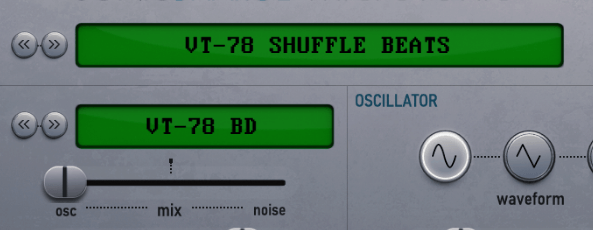
Magnus Lidström
- LarsErik wrote:
I'm trying out new fonts for the displays and the "licensed to" but I'm having problem understanding what the displayfont_x2.png and inprintcharacters_x2.png codepage are. Anyone knows?
The displayfont resource file ends with an ÿ and then a blank. So it's like it's Windows-1252 but not quite.
Here's how the silver skin looks with a DOS font:Long time ago since I made this, but I believe it should be ISO-8859-1. This has always been my standard 8-bit encoding.
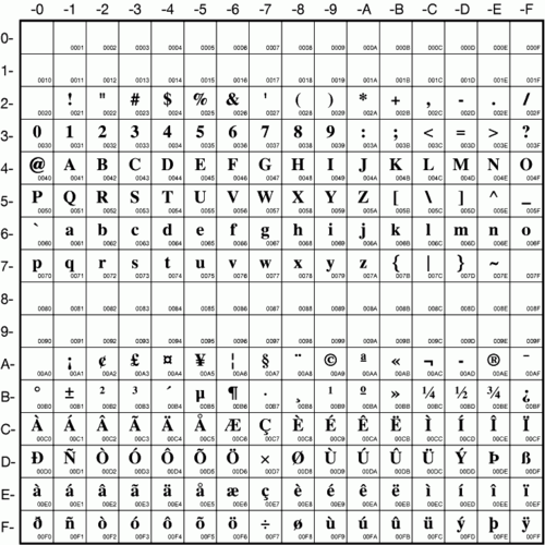
Seems correct?
larserik
- Magnus Lidström wrote:
- LarsErik wrote:
Long time ago since I made this, but I believe it should be ISO-8859-1. This has always been my standard 8-bit encoding.
I'm trying out new fonts for the displays and the "licensed to" but I'm having problem understanding what the displayfont_x2.png and inprintcharacters_x2.png codepage are. Anyone knows?
The displayfont resource file ends with an ÿ and then a blank. So it's like it's Windows-1252 but not quite.
Here's how the silver skin looks with a DOS font:
Seems correct?Yes that's correct. Thanks.
larserik
Made some changes to the dark and silver skins.
Download here: https://l4rs3rik.github.io/microtonic/Tonic Silver
- Selected channel button stays yellow to indicate it is the selected channel. When clicking yellow color is used instead of white. (Thanks Manuel Senfft for pointing out that my skins are not showing the selected channel clearly.)
- Mute button is remade to be less red and have the same look as the red "edit all" button.
- License information font is changed to be smaller and all caps.

-
Tonic Dark
- Selected channel button stays red to indicate it is the selected channel. (Thanks to Manuel Senfft for your feedback.)
- Selected pattern select button stays red when playback is stopped. (Thanks to Christian F for noticing this.)
- New font for the preset and patch names.
- License information font is changed to be smaller and all caps.
- Red sequencer step buttons have a new softer look.

Luis Bicho
Ok, i am newbie with PixelSequencer, how can i make it run,
it just pop up and closes automaticly.larserik
- Luis Bicho wrote:
Ok, i am newbie with PixelSequencer, how can i make it run,
it just pop up and closes automaticly.What is the PixelSequencer?
Sjoerd van Geffen
- LarsErik wrote:
- Luis Bicho wrote:
What is the PixelSequencer?
Ok, i am newbie with PixelSequencer, how can i make it run,
it just pop up and closes automaticly.See first post... I'm a bit surprised you're asking, since you must have been using it yourself?
- Fredrik Lidström wrote:
[...] a simple command-line utility to convert between frame strips and pixel strips [...]@Luis: it's a command line tool, so you should probably open a terminal window first. Are you running Windows or MacOS?
Sjoerd van Geffen
Talking about fonts, I'm having quite some fun with a font file that obfuscates text into a bunch of alchemical and astrological characters so I can focus on the creative rather than rational side of things. :-)

displayfont_x2.alchemy&astrology.zip(88.4kB, 1465 downloads)(It needs a bit more tweaking...)
larserik
- Sjoerd van Geffen wrote:
- LarsErik wrote:
See first post... I'm a bit surprised you're asking, since you must have been using it yourself?- Luis Bicho wrote:
What is the PixelSequencer?
Ok, i am newbie with PixelSequencer, how can i make it run,
it just pop up and closes automaticly.Ah.. I was thinking there was some script sequencer you could use in Microtonic. Threw me off there.. Sorry about the confusion.
larserik
- Sjoerd van Geffen wrote:
Talking about fonts, I'm having quite some fun with a font file that obfuscates text into a bunch of alchemical and astrological characters so I can focus on the creative rather than rational side of things. :-)
displayfont_x2.alchemy&astrology.zip(88.4kB, 1465 downloads)
(It needs a bit more tweaking...)So you don't want to be able to read the patch and preset names? That's a bold move. Looks really nice, is that a freeware font?
Manuel Senfft
Wow, thank you so much, LarsErik, for this new updated versions of the skins. Just so cool! ((=
Sjoerd van Geffen
- LarsErik wrote:
So you don't want to be able to read the patch and preset names? That's a bold move. Looks really nice, is that a freeware font?Well, not always, of course, but it is easy enough to switch between different skins now. And in some circumstances I find myself quite sensitive to variations in user interfaces when it comes to inspiration, style and creative flow. So I'll probably make one skin more focused on some colourful eye candy at the expense of strictly rational functionality. Things like those knobs with planets will likely end up there - which led me to the idea of using astrological symbols in the first place:

The main skin I'm working on now is a vintage style mashup of the classic Roland drum machines. In the end it will probably become a 808-ish 'dark mode' skin and a 707/909-ish light toned skin. I'm making steady progress but it takes a lot of tweaking until I'm satisfied.
Here's a preview of the TR-707/727-style matrix editor that I have just created for it:
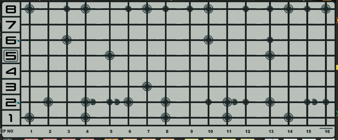
Another side project is a TR80R skin, reusing much of the UI elements of Permut8. They should look pretty cool side by side, much like they interact very well in the sonic domain. While it's a bit of a design challenge, that's part of the fun for me, and I'm very optimistic about getting a satisfactory result there as well. It will just take more time... but since I'm currently living under a mandatory curfew, I have a few more things to keep me from roaming the streets at night during the coming weeks.
As for the fonts I used for the astro/alchemy symbols: it's "Apple Symbols" and "Wingdings" and came with my computer. So probably not freeware but I have no hesitation whatsoever about using them freely and dare Apple to sue me over it (full disclosure: Apple has paid me lots of money in the past for advice on intellectual property law, which made them a much bigger bunch of money as well).
Luis Bicho
- Sjoerd van Geffen wrote:
- LarsErik wrote:
See first post... I'm a bit surprised you're asking, since you must have been using it yourself?- Luis Bicho wrote:
What is the PixelSequencer?
Ok, i am newbie with PixelSequencer, how can i make it run,
it just pop up and closes automaticly.- Fredrik Lidström wrote:
@Luis: it's a command line tool, so you should probably open a terminal window first. Are you running Windows or MacOS?
[...] a simple command-line utility to convert between frame strips and pixel strips [...]on Win10 and Yes, i make it to work yesterday, one more question do you edit images in vector or no? Does this software also work for Knobs and faders it make sequencial images, JKnobMan by "https://www.g200kg.com/", thanks
Sjoerd van Geffen
- Luis Bicho wrote:
on Win10 and Yes, i make it to work yesterday, one more question do you edit images in vector or no? Does this software also work for Knobs and faders it make sequencial images, JKnobMan by "https://www.g200kg.com/", thanksOn Windows I think you need something like Windows Terminal - it's been a while since I have used Windows and things changed a lot so I can't give exact instructions.
I use various tools for graphics, and use both bitmaps and vectors, and both 2D and 3D. I prefer open source tools like Inkscape (vectors), GIMP / Krita (2D bitmaps), and Blender for anything 3D. To be honest, every time I read "JKnobMan" it makes me cringe. Imho nothing useful will ever come out of that.
larserik
- Sjoerd van Geffen wrote:
- LarsErik wrote:
Well, not always, of course, but it is easy enough to switch between different skins now. And in some circumstances I find myself quite sensitive to variations in user interfaces when it comes to inspiration, style and creative flow. So I'll probably make one skin more focused on some colourful eye candy at the expense of strictly rational functionality. Things like those knobs with planets will likely end up there - which led me to the idea of using astrological symbols in the first place:
So you don't want to be able to read the patch and preset names? That's a bold move. Looks really nice, is that a freeware font?
Sounds like a solid idea to me.
The main skin I'm working on now is a vintage style mashup of the classic Roland drum machines. In the end it will probably become a 808-ish 'dark mode' skin and a 707/909-ish light toned skin. I'm making steady progress but it takes a lot of tweaking until I'm satisfied.
Here's a preview of the TR-707/727-style matrix editor that I have just created for it:
Another side project is a TR80R skin, reusing much of the UI elements of Permut8. They should look pretty cool side by side, much like they interact very well in the sonic domain. While it's a bit of a design challenge, that's part of the fun for me, and I'm very optimistic about getting a satisfactory result there as well. It will just take more time... but since I'm currently living under a mandatory curfew, I have a few more things to keep me from roaming the streets at night during the coming weeks.You hinted the Permut8 inspiration a while back, sounds like a solid design idea as well. TR-style or Roland-style can't go wrong. I like the matrix sequencer look.
Luis Bicho
Thats huge, Thanks .
Christian F.
- LarsErik wrote:
Made some changes to the dark and silver skins.
Download here: https://l4rs3rik.github.io/microtonic/Thank you so much!
Yes, it's official, I'm a celebrity now. Just this morning the swedish king called and congratulated me on my achievements volunteering in the pixel pushing industry.
ROFL!
Sjoerd van Geffen
The TR80R skin is coming together well enough now that I'm confident to show a preview of it. Thanks to some Chinese virus for the progress. I like how all the dark grey and orange with a sprinkle of green looks in Bitwig now, it has quite a similar feel.
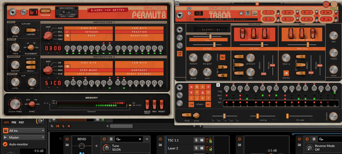
@Magnus / Fredrik: I have been staring at the main.cushy file and hacking around a bit but can't figure out if the MIDI file icon can be moved away from the top left corner, or whether the morph lLEDs can be repositioned at all. Also, I wonder if it's possible to permanently attach an additional control to the GUI like the morph slider, for example with some functionality similar to the MacroTweak script. Do you perhaps have a hint or a clue?
larserik
- Sjoerd van Geffen wrote:
The TR80R skin is coming together well enough now that I'm confident to show a preview of it. Thanks to some Chinese virus for the progress. I like how all the dark grey and orange with a sprinkle of green looks in Bitwig now, it has quite a similar feel.
Looking good.
Sjoerd van Geffen
- LarsErik wrote:
- Sjoerd van Geffen wrote:
Looking good.
The TR80R skin is coming together well enough now that I'm confident to show a preview of it. Thanks to some Chinese virus for the progress. I like how all the dark grey and orange with a sprinkle of green looks in Bitwig now, it has quite a similar feel.
Thanks - such a compliment means just that tiny bit more coming from someone who has made some beautiful skins for MicroTonic himself! A lot of pixel pushing and polishing is obviously still needed, but at this point at least it seems quite feasible to stay close enough to the Permut8 design style without making MictoTonic look completely dysfunctional.
Magnus Lidström
working on something here...
Sjoerd van Geffen
- Magnus Lidström wrote:
working on something here...Nice. Better make that a scrolling view or there will only be enough room to fit one more skin. ;-)
(Did you notice my question above btw?)
Joey Luck
These skins look really great!!!
Magnus, that will be a very handy feature! :)
larserik
- Magnus Lidström wrote:
working on something here...Nice!
Magnus Lidström
- Sjoerd van Geffen wrote:
- Magnus Lidström wrote:
Nice. Better make that a scrolling view or there will only be enough room to fit one more skin. ;-)
working on something here...
(Did you notice my question above btw?)The window will adjust to fit, but max is 12 skins right now. I don't have scroll support in Cushy (yet). The pink one is just a test btw. ;)
About modding the main.cushy file. Yeah, it's possible to do a lot with this, including implementing scripts directly into the main UI. Microtonic isn't fully ported over to "Cushy" (unlike our other products) so alas, you cannot use it to reposition stuff in the synth and pattern sections. But most of the toolbar at the top is implemented with Cushy, as well as all the new scripts.
Said this, I kind of regret we put Cushy and Javascript files into the Skin Template zip. The reason is that if we need to adjust some of these files for an upgrade and an alternative skin also includes them, the skin's files will be used instead of the built-in and we cannot guarantee the stability of the upgrade.
I'm thinking of making a separate include file for colors, and maybe widget positions, that could be changed instead of hacking main.cushy etc.
EnochLight
- Magnus Lidström wrote:
working on something here...SWEEEEET!!!! Very cool update!
Manuel Senfft
Reaaaally cool! Thanks for working on this. <3
Sjoerd van Geffen
- Magnus Lidström wrote:
The window will adjust to fit, but max is 12 skins right now. I don't have scroll support in Cushy (yet). The pink one is just a test btw. ;)In that case I would suggest to superimpose the skin / creator names on top of the thumbnails or leave them out entirely to make room for a few more (imho such info is almost completely irrelevant at the point pf actual usage).
About modding the main.cushy file. Yeah, it's possible to do a lot with this, including implementing scripts directly into the main UI. Microtonic isn't fully ported over to "Cushy" (unlike our other products) so alas, you cannot use it to reposition stuff in the synth and pattern sections. But most of the toolbar at the top is implemented with Cushy, as well as all the new scripts.
Yeah, I figured out as much by staring at the files. However, I can't find out how to move the MIDI file icon or morph slider LEDs, so I'd like to find out if I'm overlooking anything or not.
As for adding a control, I'll have another hard look and give it a try, but I may need to hit you up to provide a simple example if I can't figure it out.
Said this, I kind of regret we put Cushy and Javascript files into the Skin Template zip. The reason is that if we need to adjust some of these files for an upgrade and an alternative skin also includes them, the skin's files will be used instead of the built-in and we cannot guarantee the stability of the upgrade.
Gotcha. So ideally, (for freely distributable skins) we should not mess with the Cushy and Javascript files at this point, and patiently await a future update to do such things in a smarter manner. I guess we should be relatively safe though if we only change some color codes - as messed up colors aren't really a stability risk.
I'm thinking of making a separate include file for colors, and maybe widget positions, that could be changed instead of hacking main.cushy etc.
Yeah, that makes a lot of sense. While you're at it, please also consider changing widget types (e.g. from horizontal to vertical slider or rotary knob) and numbers of slices/frames for even more powerful skinning possibilities. Probably way too much to ask for now, but perhaps something to consider for a more extensive future revision?
larserik
I couldn't resist making a skin derived from the tonic silver with some added color. (I promise I won't make green, yellow or red versions. Just this one.) It's named after the famous "look" in the Zoolander movie.
Tonic Blue Steel
Download: https://l4rs3rik.github.io/microtonic/

Sjoerd van Geffen
- LarsErik wrote:
I couldn't resist making a skin derived from the tonic silver with some added color. (I promise I won't make green, yellow or red versions. Just this one.)Haha I feel a similar temptation... so I was thinking of adding multiple versions of the background image in a single skin package to provide users with some choice of colors. Or even include a .svg file where users can easily tweak some color values and then generate the images themselves.
Sjoerd van Geffen
- Sjoerd van Geffen wrote:
[...] if the MIDI file icon can be moved away from the top left corner [...]
A little image to illustrate my use case: I was trying to move most menu controls to a bar on the left side rather than the top, but got stuck on an apparently non-movable MIDI file icon:

Manuel Senfft
- LarsErik wrote:
I couldn't resist making a skin derived from the tonic silver with some added color. (I promise I won't make green, yellow or red versions. Just this one.) It's named after the famous "look" in the Zoolander movie.
Tonic Blue Steel
Download: https://l4rs3rik.github.io/microtonic/
Wow! :D
antic604
- LarsErik wrote:
Tonic Silver skin is now done if you want to try it out.
Download is on my github here: https://l4rs3rik.github.io/microtonic/
Oh my! I never considered getting Microtonic, but I might just now :o
EnochLight
- antic604 wrote:
Oh my! I never considered getting Microtonic, but I might just now :oIt is literally the best drum synth plugin on the market - GET IT!!!
philter
wow, i see a lot of great stuff has been posted here since my last visit, very impressive guys!
had some problems while creating a few skins by myself , and after trying to create custom png files i also ended up editing the original files, which solved at least a few issues for me. when i look at the amount of posts (and the GREAT skins you all created!) it seems very likely that the solution to my problems has already been discussed here, i just have to read the last posts .philter
- Magnus Lidström wrote:
working on something here...a skin chooser like that would be really great! i love it
philter
- EnochLight wrote:
- antic604 wrote:
It is literally the best drum synth plugin on the market - GET IT!!!
Oh my! I never considered getting Microtonic, but I might just now :oyeah, once you go microtonic you never go back!
i can only agree, it IS the best drum synth plugin on the market.
and when you consider that it´s first version has been released over 17 (!) years ago,
but it is still getting optimised and updated by the sonic charge team....just amazing
You need to be signed in to post a reply