Magnus Lidström
😍😍😍
philter
woohooooo finally skins are coming! i did a few skins in the past for personal use, for example this "dark mode" skin that i personally use often. but the "new" stuff you posted here, with completely different knobs and graphics is really blowing me away !
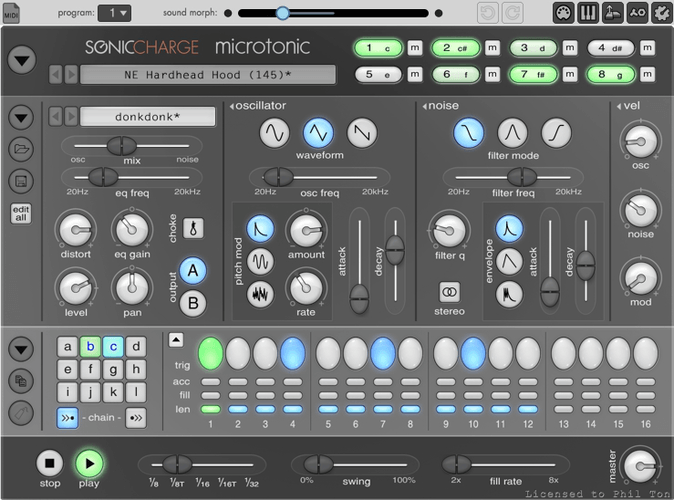
i will make a zip file with my skins and upload them later if anyone is interested....grymmjack
Yes! Philter please
Sjoerd van Geffen
- Fredrik Lidström wrote:
[...] It is also possible to create a text file named "Microtonic V3.3 Resources Path.txt" containing the full path to where you want Microtonic to search for resources.I'm having trouble getting this to work. On my MacOS 10.13.6 system, I placed a folder named
Microtonic V3.3 Resourcesin/Library/Application Support/Sonic Charge(whereMicrotonic Scriptsalso resides). It contains a variation of the filebackground_x2.png.Then I tried various formats for the path, e.g.:
/Library/Application Support/Sonic Charge
/Library/Application\ Support/Sonic\ Charge
/Library/Application Support/Sonic Charge/
/Library/Application\ Support/Sonic\ Charge/
/Library/Application Support/Sonic Charge/Microtonic V3.3 Resources
/Library/Application\ Support/Sonic\ Charge/Microtonic\ V3.3\ Resources
/Library/Application Support/Sonic Charge/Microtonic V3.3 Resources/
/Library/Application\ Support/Sonic\ Charge/Microtonic\ V3.3\ Resources/None of them seem to work... what am I doing wrong?
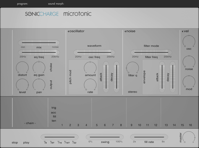
In case anyone else likes to add those nifty log scales (for the 3 horizontal frequency sliders and the 4 vertical attack / release sliders) from the Vintage Tonic skin to the default skin, I quickly made both a light and a dark version - I haven't made up my mind which I like best.
Light:
Dark: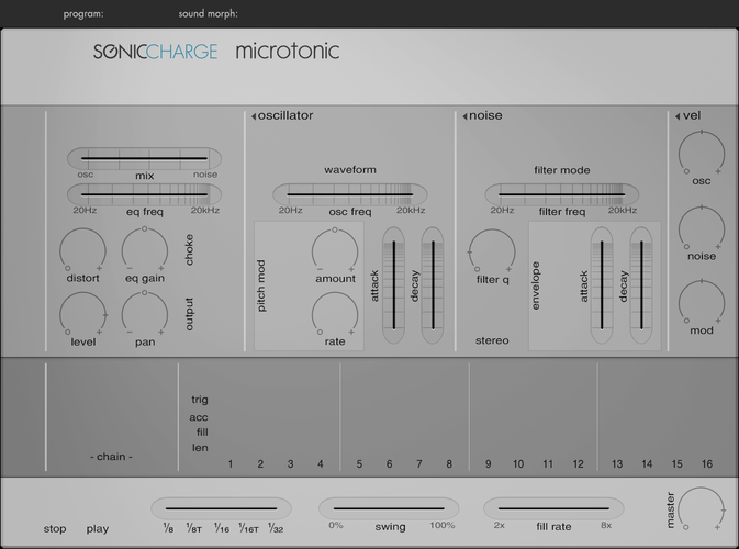
Stefan Smith
I double click the .exe and a box flashes up very briefly but nothing appears to have happened. Looked in the sonic charge folder for any new folders or whatever and nothing appears to be different. Any ideas?
Fredrik Lidström
- Sjoerd van Geffen wrote:
I'm having trouble getting this to work. On my MacOS 10.13.6 system, I placed a folder namedMicrotonic V3.3 Resourcesin/Library/Application Support/Sonic Charge(whereMicrotonic Scriptsalso resides). It contains a variation of the filebackground_x2.png.Yeah sorry, you need to put it next to your Microtonic.vst which is in
/Library/Audio/Plug-Ins/VST. As I mentioned, skinning is more of a hack than a well thought out feature. This is actually how I work when I create GUIs for all our products. I just put an interface reload button in the corner and can test things out and adjust stuff without having to recompile or restart the host. It's still in there if you need it, inside the main.cushy you can find a "Development views" section with a reload button, just setvisibility: trueFredrik Lidström
- Stefan Smith wrote:
I double click the .exe and a box flashes up very briefly but nothing appears to have happened. Looked in the sonic charge folder for any new folders or whatever and nothing appears to be different. Any ideas?I think you might have downloaded my image-tool (pixelSequencer). You only need that if you gonna create your own skin. Download the zip file in my second post and then extract the
Microtonic V3.3 Resourcesfolder and put it in your VST folder, right next to Microtonic.dllSjoerd van Geffen
- Fredrik Lidström wrote:
[...]Thanks, good to know. I was trying to use the .txt file with path because it seemed a good way to avoid having to duplicate things for the AU .component. Perhaps symlinks work, otherwise I'll just have to copy stuff around. Not a big deal, I don't plan to change the skin very often and it's not a huge waste of resources either. A hack is already more than good enough.
Thanks for that tip on Development views as well; I'll check it out.
Fredrik Lidström
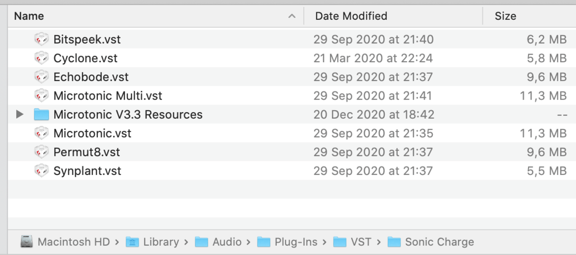
Microtonic V3.3 Resources Path.txtworks as well, but it also must be next to the Microtonic.dll (Windows), Microtonic.vst (Mac VST) or Microtonic.component (Mac AU)Like this, on Windows, where my VSTs are in
C:\Program Files (x86)\Cakewalk\Vstplugins\Sonic Charge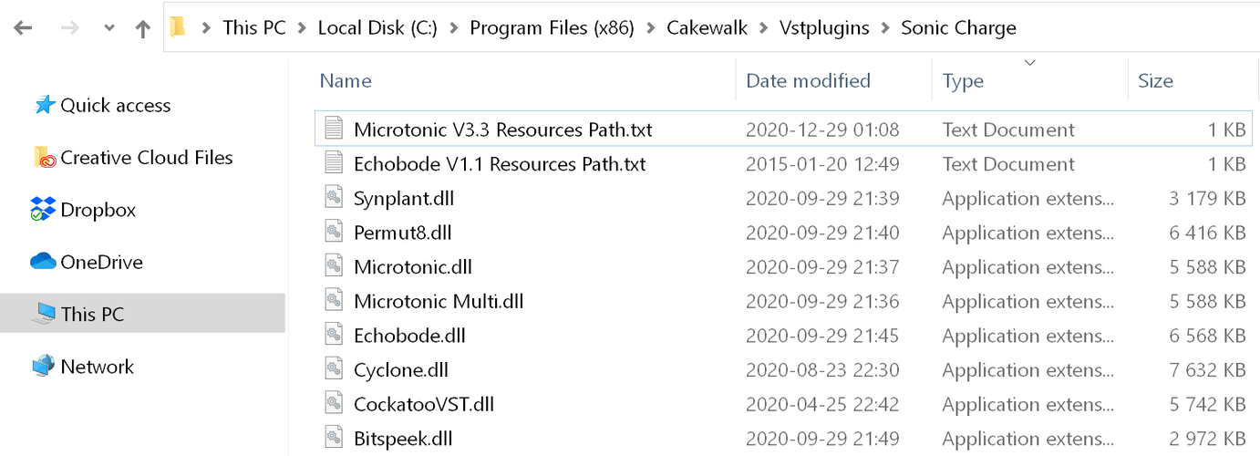
or like this for VST on Mac where I have a folder in this picture, but a .txt file works fine.
larserik
Oh this is great news!
Thanks for making skinning possible! I'm looking forward to countless hours in Blender and Photoshop making a skin for this fantastic drum synth.
Sincerely
Lars-ErikSjoerd van Geffen
- Fredrik Lidström wrote:
[...]Gotcha, got it working now (I think I was testing it with the dark version of my modded background, which somehow does not show up; I guess the lines aren't dark enough).
The interface reload button does not always seem to work, but I can live without it just fine.
Where I ran into a problem now is using pixelSequencer to encode. Decoding worked just fine, however encoding did not. I have attached its output for your reference, as to not spam this forum with error logs.
pixelSequencer.log.txt(6.11kB, 1619 downloads)So as a hack around a hack, I just edited the encoded files directly, which sort of worked. Some results so far: I added some TR-808 style colored buttons to the Vintage Tonic skin. They're a bit pale because semi-transparent grey buttons are superimposed on a colored background, but it gets me the effect I was going for. I'll probably improve on it if I manage to get the encoding working.

In case anyone else wants them:
VT-808.zip(962kB, 1675 downloads)Fredrik Lidström
Haha, I wanted to do different colors but did not think of that trick. 😲
Looks like when I built the pixelSequencer command on my MacOS 10.15, it's linking to stuff you do not have in your OS version. Maybe I can rebuild targeting an older version. What are you using?
And sorry, yes, the reload button does not seem to work that great on Microtonic. It does not trigger reload of the image resources.
Sjoerd van Geffen
I'm on 10.13.6 currently (but should upgrade soonish after doing proper backups and such).
And please feel free to use that trick to improve on my results - I'm sure you can easily do a better job than this quick sloppy hack. Btw, I also love the retro-style file icons for the Vintage Tonic stuff, I guess you're responsible for those as well? My compliments!
Stefan Smith
THanks for getting back and correcting me. I have extracted that folder in the same folder as the microtonic dll. Is there anything else i should do as the skin looks the same? Thanks
J. Pablo Arceo
- vectro wrote:
Teal and orange in the making.Nice!
larserik
Here's a preview of what I'm working on, the design idea is "dark with blinking buttons" and now things are finally starting to look somewhat consistent. Still lots of tweaking, testing and polishing to be done.
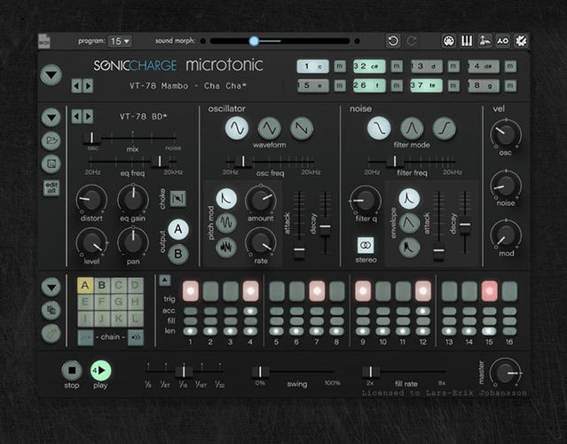
Edit: The cluttered numbers on the buttons here and there are only there for me to keep track of what file and what part of the sprite sheet that is being used. They will be remove later.
Christian F.
That looks awesome!
larserik
- Christian F. wrote:
That looks awesome!Thanks!
Magnus Lidström
- LarsErik wrote:
Here's a preview of what I'm working on, the design idea is "dark with blinking buttons" and now things are finally starting to look somewhat consistent. Still lots of tweaking, testing and polishing to be done.Woah! I need this skin. 😲
EnochLight
- Fredrik Lidström wrote:
To test out the custom skin possibilities I created a retro skin for the Vintage Tonic release.
Microtonic Skin Vintage Tonic V3.3.zip(924kB, 3534 downloads)This is brilliant - thanks!!!
EnochLight
- LarsErik wrote:
Here's a preview of what I'm working on, the design idea is "dark with blinking buttons" and now things are finally starting to look somewhat consistent. Still lots of tweaking, testing and polishing to be done.
Edit: The cluttered numbers on the buttons here and there are only there for me to keep track of what file and what part of the sprite sheet that is being used. They will be remove later.LOVE THIS!!! Please share once you finish - really love how this is coming along!
Sjoerd van Geffen
- Magnus Lidström wrote:
- LarsErik wrote:
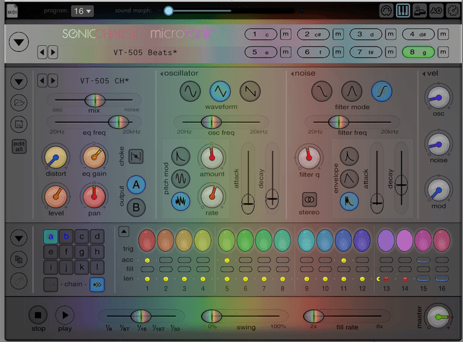
Here's a preview of what I'm working on, the design idea is "dark with blinking buttons" and now things are finally starting to look somewhat consistent. Still lots of tweaking, testing and polishing to be done.Slick looks! And much the same here... plenty more work needed, but definitely getting somewhere already. Love to see you using Blender btw! I'm gonna do an 808-style knob in Blender as well - for the switch button I might get away with convincingly faking it in 2D. Some previews below.
Woah! I need this skin. 😲
While I do enjoy a challenge of working within the given restrictions... how could we convince you to code up a minor update for slightly expanded skinning support? I'd love to be able to change control locations, dimensions, and hit zones. And I'm sure users would love to see an easy method to switch between skins once we have some interesting options available.
Jellybeans Rainbow
Rhythm Impostor
larserik
Fun to see what others are working on!
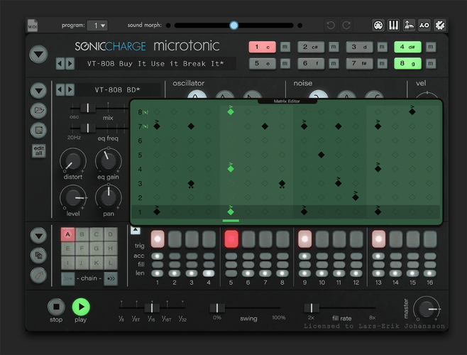
I'm getting close to complete now. Yesterday I managed to get the matrix editor and all the blinking buttons finished. I'm guessing some tweaks here and there and then I'll share it.
Sjoerd van Geffen
For the matrix editor I'm going for the TR-707 style. About as ugly as a pocket calculator. :)
Magnus Lidström
- Sjoerd van Geffen wrote:
While I do enjoy a challenge of working within the given restrictions... how could we convince you to code up a minor update for slightly expanded skinning support? I'd love to be able to change control locations, dimensions, and hit zones. And I'm sure users would love to see an easy method to switch between skins once we have some interesting options available.We do have this technology fully implemented in the other products and partly in Microtonic (for the bar at the top, the PO-32 section and scripts). Check the main.cushy file to see what it looks like.
However, .cushy files may be a bit too deep for skinning as they define all kinds of aspects of the user interface, including a scripting layer even. Updates from us will often include changes to the .cushy-files. I think I need to come up with a better solution that will not break with every update.
Jellybeans Rainbow
Omg! This is brilliant too. You guys rock.
🍭🍭🍭
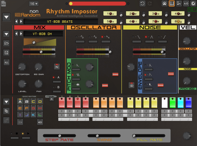
Rhythm Impostor
Haha, Random!
Magnus Lidström
- LarsErik wrote:
I'm getting close to complete now. Yesterday I managed to get the matrix editor and all the blinking buttons finished. I'm guessing some tweaks here and there and then I'll share it.Looking forward to this!
Sjoerd van Geffen
- Magnus Lidström wrote:
- Sjoerd van Geffen wrote:
We do have this technology fully implemented in the other products and partly in Microtonic (for the bar at the top, the PO-32 section and scripts). Check the main.cushy file to see what it looks like.
While I do enjoy a challenge of working within the given restrictions... how could we convince you to code up a minor update for slightly expanded skinning support? I'd love to be able to change control locations, dimensions, and hit zones. And I'm sure users would love to see an easy method to switch between skins once we have some interesting options available.
However, .cushy files may be a bit too deep for skinning as they define all kinds of aspects of the user interface, including a scripting layer even. Updates from us will often include changes to the .cushy-files. I think I need to come up with a better solution that will not break with every update.Jellybeans Rainbow
Omg! This is brilliant too. You guys rock.
🍭🍭🍭Rhythm Impostor
Haha, Random!It's non random, because it is AI controlled! :p Messing up Roland's logo for some skins for D16's drum machines was both easier and funnier - I just scratched out the R's 2nd leg to get "Poland".
larserik
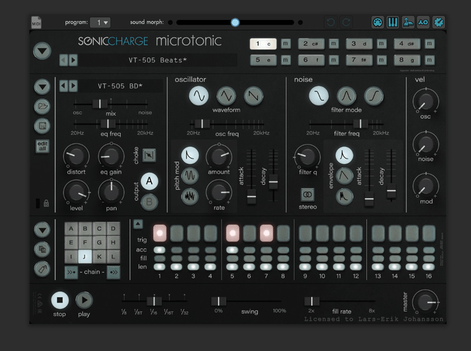
Aaaaand now I'm done with the "tonic dark"-skin, at least for now.
Download from my github: https://l4rs3rik.github.io/microtonic/
Manuel Senfft
Just wow. Beautiful! Good thing that it has a Kensington lock on the site, haha! :D
Thank you for sharing! <3
larserik
- Manuel Senfft wrote:
Just wow. Beautiful! Good thing that it has a Kensington lock on the site, haha! :D
Thank you for sharing! <3Good to hear that you like it.
(If you decide to use it you can securely lock it to your DAW with the kensington lock slot. :D)
Manuel Senfft
(If you decide to use it you can securely lock it to your DAW with the kensington lock slot. :D)
:D :D
Ferengi
Hi Lars, this is a totally cool skin !
I like dark surfaces because of my large bright sceen.
Thank you very much for your work !
I will use this skin now.Only one thing could be better for my opinion.
The fader could have a little more contrast at the background.Christian F.
LarsErik, thank you so much for sharing!
The following nitpicking is just because I like this skin very much:
- Blue color of the pattern buttons does not fit.
- The two lighter shade rectangles in the background don't look good to me
- Some of the clear-plastic-button reflection lines are a tad too much
Anyway, I still use the skin and thank you again, cheers!
larserik
I've seen some errors that I'm planning on fixing. Mostly pixel alignment stuff and other minor things.
But other then that I'm pretty happy with the result.
Steven Sauve
i will make a zip file with my skins and upload them later if anyone is interested....
Yes please Philter!!
larserik
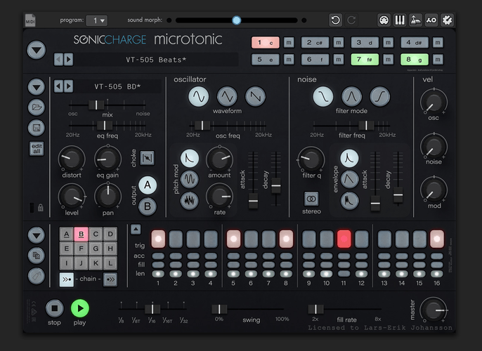
I was planning to fix some minor errors but then I kept going.. So I guess I've just made a new revision.
List of changes
- The pattern select buttons have added green color and way better looking blinking animation when in playback. (Now has the same feel to the blinking as the play button.)
- Pattern select buttons have improved lettering: (A to L) has an underscore when the patterns playing are part of a pattern chain.
- All UI controls have cutouts in the microtonic box/background making them stand out more.
- Changed plastic material for all buttons (less subsurface scattering) when in off-mode and a more blue:ish color.
- Christian F was right: The shade rectangles looked weird, changed them to a more rounded feel and also made them less bright.
Download
My github: https://l4rs3rik.github.io/microtonic/
Preview:
Christian F.
Perfect! 😍
Manuel Senfft
Ouuff ... are you a designer, by the way? Just really great work. Loving it! Update is great. Thanks again for the free sharing! <3
Greg Killmaster
I can't figure out how to change to different skins within mTonic. How do you do this. I have a thrid party skin in the same place as the Vintage Tonic Skin but I don't know how to select it.
Koshdukai
AFAIK, there's no skin management within mTonic. I use the "Microtonic V3.3 Resources Path.txt" file to point at the skin folder I want and "restart" the plugin.
Greg Killmaster
- Koshdukai wrote:
AFAIK, there's no skin management within mTonic. I use the "Microtonic V3.3 Resources Path.txt" file to point at the skin folder I want and "restart" the plugin.Thanks but haven't been able to get that to work. I'm on Mac and I put the "Microtonic V3.3 Resources Path.txt" file here: /Library/Audio/Plug-Ins/VST/Sonic\ Charge/.
Here is the contents of the file with the full path to the skin I want:
"/Library/Audio/Plug-Ins/VST/Sonic\ Charge/tonicDark v3.3 Resources/"(without quotes)
I can't seem to get it to work. What am I doing wrong please?
Magnus Lidström
- Greg Killmaster wrote:
Here is the contents of the file with the full path to the skin I want:
"/Library/Audio/Plug-Ins/VST/Sonic\ Charge/tonicDark v3.3 Resources/"Try without the backslash.
larserik
- Christian F. wrote:
Perfect! 😍- Manuel Senfft wrote:
Ouuff ... are you a designer, by the way? Just really great work. Loving it! Update is great. Thanks again for the free sharing! <3Very kind words guys, I appreciate it. (No, I'm not a designer, I'm just a pixel pusher.)
Greg Killmaster
- Magnus Lidström wrote:
- Greg Killmaster wrote:
Try without the backslash.
Here is the contents of the file with the full path to the skin I want:
"/Library/Audio/Plug-Ins/VST/Sonic\ Charge/tonicDark v3.3 Resources/"yay! that worked! Thanks for speedy reply!
Edouard
- colin wrote:
ultra-retro in the making :DLooks great!
Joshua Wilken
- LarsErik wrote:
I was planning to fix some minor errors but then I kept going.. So I guess I've just made a new revision.
List of changes
---------------
- The pattern select buttons have added green color and way better looking blinking animation when in playback. (Now has the same feel to the blinking as the play button.)
- Pattern select buttons have improved lettering: (A to L) has an underscore when the patterns playing are part of a pattern chain.
- All UI controls have cutouts in the microtonic box/background making them stand out more.
- Changed plastic material for all buttons (less subsurface scattering) when in off-mode and a more blue:ish color.
- Christian F was right: The shade rectangles looked weird, changed them to a more rounded feel and also made them less bright.
Download
---------------
My github: https://l4rs3rik.github.io/microtonic/
Preview:Mannnn thanks for making this! Its just made an old friend feel totally new again! Excellent work!
Sjoerd van Geffen
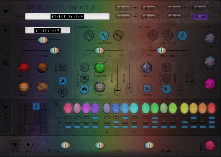
Spacing out here in party mode. :)
Peter L
@LarsErik thank you so much..... this is awesome....
and of course Magnus and Fredrik...Really guys the thing is a gem, thank you for continuing to develop it.
larserik
- Sjoerd van Geffen wrote:
Spacing out here in party mode. :)Cool. I especially like the planets. Have you shared your skins anywhere?
Olli Treiber
- Sjoerd van Geffen wrote:
- Magnus Lidström wrote:
Slick looks! And much the same here... plenty more work needed, but definitely getting somewhere already. Love to see you using Blender btw! I'm gonna do an 808-style knob in Blender as well - for the switch button I might get away with convincingly faking it in 2D. Some previews below.- LarsErik wrote:
Here's a preview of what I'm working on, the design idea is "dark with blinking buttons" and now things are finally starting to look somewhat consistent. Still lots of tweaking, testing and polishing to be done.Woah! I need this skin. 😲
While I do enjoy a challenge of working within the given restrictions... how could we convince you to code up a minor update for slightly expanded skinning support? I'd love to be able to change control locations, dimensions, and hit zones. And I'm sure users would love to see an easy method to switch between skins once we have some interesting options available.
Jellybeans Rainbow
Rhythm Impostorwhere can i download this
Sjoerd van Geffen
- LarsErik wrote:
Cool. I especially like the planets. Have you shared your skins anywhere?- Olli Treiber wrote:
where can i download thisI have not posted anything anywhere yet guys, still playing around with various design ideas and stuff. I will definitely post something right here once I'm satisfied - but also want to avoid posting half-finished stuff that would be updated a few days later anyway. Do feel free to ask for anything if you don't have the patience to wait for that though.
Olli Treiber
- Sjoerd van Geffen wrote:
- LarsErik wrote:
I have not posted anything anywhere yet guys, still playing around with various design ideas and stuff. I will definitely post something right here once I'm satisfied - but also want to avoid posting half-finished stuff that would be updated a few days later anyway. Do feel free to ask for anything if you don't have the patience to wait for that though.
Cool. I especially like the planets. Have you shared your skins anywhere?
- Olli Treiber wrote:
where can i download thisThanks for your info.very good attitude you have.I can still be patient and look forward to your finished work.stay healthy :-)
larserik
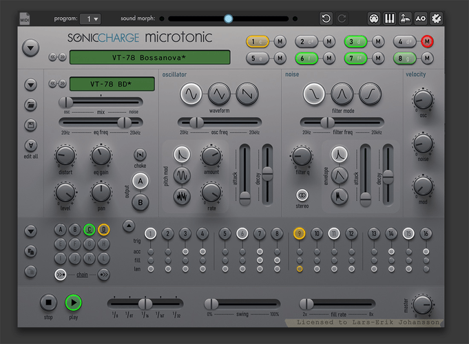
Here's a preview of my "tonic silver" skin that I'm working on.
Manuel Senfft
Wow. Really beautiful as well. Nice!
Olli Treiber
- LarsErik wrote:
Here's a preview of my "tonic silver" skin that I'm working on.very nice.great job.i can not wait for download :-)
Magnus Lidström
- LarsErik wrote:
Here's a preview of my "tonic silver" skin that I'm working on.Omg. Amazing work again LarsErik! You're killing it! Please finish this one too. 🙏
electronic drum
Hi LarsErik,
just like your Tonic Dark skin, this one looks fantastic, too!!! Thanks so much for your work and for sharing!
May I, however, make a few suggestions?
1) Please have a look at the distance between the label "pitch mod" and the three knobs right to it (oscillator section) and compare it to the distance between the label "envelope" and the three knobs right to that (noise section). They are not the same.
2) The other thing about distances/alignment is something that you have no influence on because you cannot move knobs around (as I understand, this is part of the code). Nonetheless, have a look at the picture for what I mean (e.g. the osc knob in the velocity section should be moved a few pixels down - or the other two knobs a few pixels up).
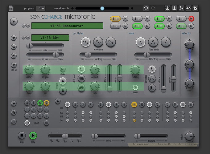
3) Could you, please, provide an alternative without the tape strip in the bottom right corner (where it says "Licensed to ...")? I know this is a matter of taste, but maybe as an additional alternative ....
4) Once you have finished, could you try red buttons for the sequence part (similar or equal to the ones for the mute buttons at the top)? The buttons in your skin have instantly reminded of the buttons on the Korg M1, this is why this idea has occured to me. Admiitedly, I do not know if this is a good idea ...
I hope I do not come across as being nitpicking here, These are just some thoughts that came to my mind when I saw your draft for your next skin. I am really thankful for your efforts and for you sharing these with the community!!!
larserik
- Manuel Senfft wrote:
Wow. Really beautiful as well. Nice!- Olli Treiber wrote:
very nice.great job.i can not wait for download :-)- Magnus Lidström wrote:
Omg. Amazing work again LarsErik! You're killing it! Please finish this one too. 🙏Thanks guys, I appreciate it.
larserik
- electronic drum wrote:
Hi LarsErik,
just like your Tonic Dark skin, this one looks fantastic, too!!! Thanks so much for your work and for sharing!
May I, however, make a few suggestions?That was very specific. :D
I've read what you've written and I understand your concerns but at the end of the day I'm not going to take specific requests. I have an idea in my mind what I want for myself and I'll keep going moving pixels around until I get close enough or I give up, whatever happens first.
Sjoerd van Geffen
inprintcharacters_x2.png.zip(3.85kB, 1556 downloads)
3) Could you, please, provide an alternative without the tape strip in the bottom right corner (where it says "Licensed to ...")? I know this is a matter of taste, but maybe as an additional alternative ....
For any Microtonic v3.3 skin (including the default one): if you replace the file
inprintcharacters_x2.pngwith a fully transparent image then you won't see the licensee name. I've attached one for your convenience.
You need to be signed in to post a reply