larserik
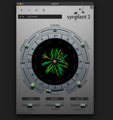
I have pushed an early version (0.8) of my Greyone skin to github. Currently it's only the x4 (largest png files) and some things are a bit rough around the edges.
Feedback and suggestions are welcome.
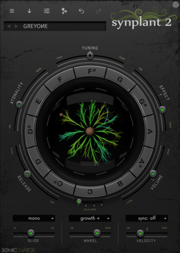
download:
https://github.com/l4rs3rik/synplant-skins/archive/refs/heads/greyone.zipInstall instructions:
The download zip is the "greyone" branch including the factory stuff, so after download and unzip copy only the "greyone" folder into your skins folder.Michael // MSLD
Ooooh! It looks pretty. Loving the ornamentation, very reminiscent of your dark0ne skin for MicroTonic.
My sole complaint is that the text is a little on the thin side; it looks great on my iMac 5K screen, but doesn't show up well on a 1080p monitor. Otherwise, excellent work so far!
larserik
- Michael // MSLD wrote:
Ooooh! It looks pretty. Loving the ornamentation, very reminiscent of your dark0ne skin for MicroTonic.
My sole complaint is that the text is a little on the thin side; it looks great on my iMac 5K screen, but doesn't show up well on a 1080p monitor. Otherwise, excellent work so far!Do you think the keyring texts are to thin? Like the TUNING, EFFECT and so on. Or do you mean the smaller green texts indicating the scale of tuning, volume etc.
Michael // MSLD
The big ones, yes. The tiny text is completely illegible on my 1080p screen unless I make the GUI massive. 😅 I might also try for a higher luminance value with all text; that would make reading it a bit easier and you might not even need to increase the text weight.
larserik
- Michael // MSLD wrote:
The big ones, yes. The tiny text is completely illegible on my 1080p screen unless I make the GUI massive. 😅 I might also try for a higher luminance value with all text; that would make reading it a bit easier and you might not even need to increase the text weight.Ok, thanks for you feedback. I'll do some adjustments for the keyring texts and the preset name texts to get a better balance. The green small text is secondary and needs to be kept that way to keep the UI from getting cluttered with stuff, so i'm not that concerned that it cant be read at all UI sizes and screen resolutions.
larserik
I've done a pull request into the master now. Made the font larger, that made quite a big difference of the look of things.
AEAEA
Love the skin larserik! thanks alot for sharing it with us!
Is there a way i can have a black background when genopatch & editing page is selected? Like with the nightshift skin.larserik
- AEAEA wrote:
Love the skin larserik! thanks alot for sharing it with us!Good to hear you like it.
Is there a way i can have a black background when genopatch & editing page is selected? Like with the nightshift skin.
Sure you can, just take parts of the "Synplant2_colorScheme.makaron" and replace the sections in the makaron in the greyone folder.
I can make a hack later and share a makaron with the dark version of the DNA and GENOPATCH stuff.
edit.. it turned out really great so I'm keeping the darker DNA and GENOPATCH colors. Thanks AEAEA for the idea. :D
Download here: https://l4rs3rik.github.io/synplant2/
HiEnergy Music
For me the GreyOne skin is more legible than the NightShift one. The color contrast for text is definitely better. I just have a hard time reading NightShift's light black lettering on dark grey background.
Well done, larserik.c0nsilience
larserik, very well done, indeed! I've followed your many creative adventures and threads on this forum. You are a boon to this community and make these fantastic tools even more engaging to use. Thank you 🙏
AAV
Larserik, thank you for sharing! I will try this when I get a chance later today. Many thanks!
AEAEA
- larserik wrote:
- AEAEA wrote:
Good to hear you like it.
Love the skin larserik! thanks alot for sharing it with us!Is there a way i can have a black background when genopatch & editing page is selected? Like with the nightshift skin.
Sure you can, just take parts of the "Synplant2_colorScheme.makaron" and replace the sections in the makaron in the greyone folder.
I can make a hack later and share a makaron with the dark version of the DNA and GENOPATCH stuff.
edit.. it turned out really great so I'm keeping the darker DNA and GENOPATCH colors. Thanks AEAEA for the idea. :D
Download here: https://l4rs3rik.github.io/synplant2/larserik, thanks for the new update! Love the dark version!
larserik
You're welcome guys, I do really enjoy the process of making skins so getting positive feedback like this is icing on the cake.
Currently been diving into the colors for the dna and genopatch windows using the Nightshift as a starting point. Thinking changing some of the key colors to match but it feels a bit like a rabbit hole with all the possible colors and tings one can change in the makaron-scripts. :D
So I guess an 1.1 update of Greyone with custom color schemes for the DNA and Genopatch is in the pipeline.
AEAEA
Nice one! A variation of your skin with the dracula theme would be nice to have
The color scheme is available here: https://draculatheme.com/contribute
larserik
- AEAEA wrote:
Nice one! A variation of your skin with the dracula theme would be nice to have
The color scheme is available here: https://draculatheme.com/contributeAlthough I like the dracula theme the one I'm working on now is about matching the greyone colors and brightness.
larserik
Pushed the 1.1 version of Greyone to github. Now with tweaked color schemes for the gene manipulation and the genopatch.
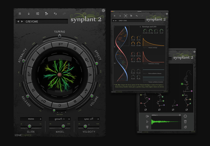
AEAEA
Nice one! Its looking good! Ty
larserik
Started work on the "paleone" and it's kind of pretty with silver polished fader pots and a sunset showing in the reflections of the plant-dome.
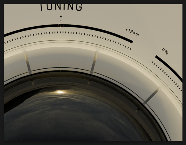
ah shit, I posted the wrong screengrab.. Well anyways, it's basically this with some pretty faders. :D
Andy Music
Sunset!!!!
larserik
- Andy Music wrote:
Sunset!!!!Yeah, thought it would be fun with a proper environment instead of studio lights and reflectors. :D
Perhaps an environment reflection of a greenhouse would perhaps be cool..
Edit: Naa a greenhouse looks just like a prison or cage in the reflections.. Back to the sunsets and blue skies with little fluffy clouds.
AAV
Looking forward to "paleone". Greyone is my new/current favourite. The changes to the gene manipulation and Genopatch screens are nice. But I still like the light background of he original factory skin on those pages, so I confess to flipping back and forth depending on what I'm doing. (I tend to also flip back and forth between skins in Microtonic too. So it might just be me.)
Anyway, love your skin's, thanks for making these available. Awesome work!larserik
- AAV wrote:
Looking forward to "paleone". Greyone is my new/current favourite. The changes to the gene manipulation and Genopatch screens are nice. But I still like the light background of he original factory skin on those pages, so I confess to flipping back and forth depending on what I'm doing. (I tend to also flip back and forth between skins in Microtonic too. So it might just be me.)
Anyway, love your skin's, thanks for making these available. Awesome work!Thank you, I'm quite happy with it myself but I feel there's more potential in this pale-version I've got going now.
Anyways, here's a makaron file for the greyone skin where the dna and genopatch colors are from the Synplant2 bright default skin. (See screenshot.)
greyone-bright_colorScheme.zip(2.69kB, 1054 downloads)
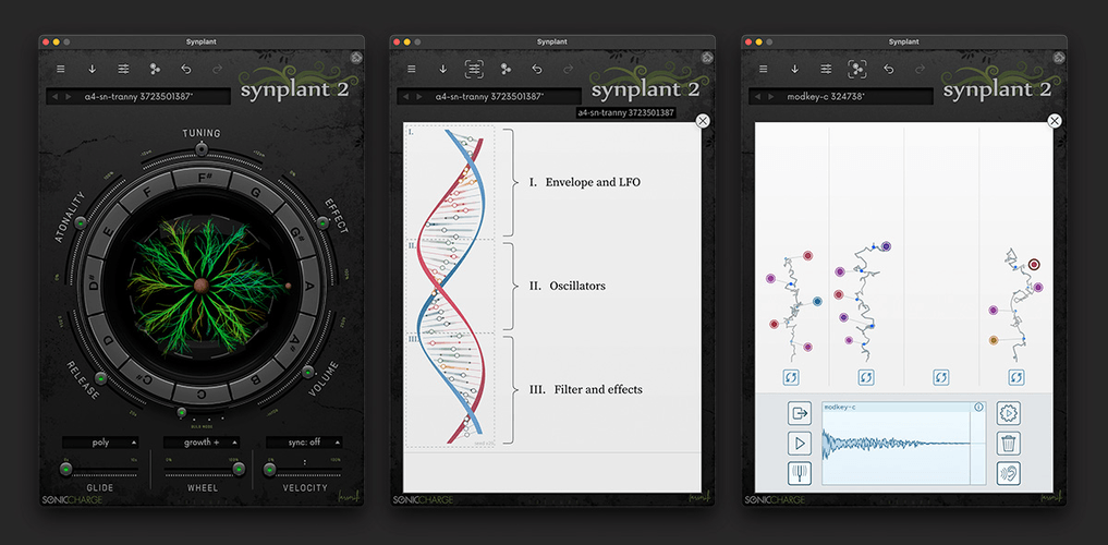
If you want to use it just download, unzip and copy the makaron-file to the Greyone folder replacing the file with the same name. If you're on Mac the path to the greyone is very likely to be at /Library/Application Support/Sonic Charge/Synplant Skins/Greyone/ and if you're on Windows I have no idea. But something similar..
AAV
Awesome Larserik. I am on Windows but will figure it out. So great if you. Thank you so much. Looking forward to trying this out.
larserik
- AAV wrote:
Awesome Larserik. I am on Windows but will figure it out. So great if you. Thank you so much. Looking forward to trying this out.👍
Bru Franco
- AAV wrote:
Awesome Larserik. I am on Windows but will figure it out. So great if you. Thank you so much. Looking forward to trying this out.You can right-click the Skin Chooser and use "Open Skins Folder".
AAV
Thank you Bru! Saved me some detective work. Will install today.
Thanks again!AAV
Hi Larserik - Well the path for Windows (11) is Program Files\Sonic Charge\Synplant Skins\Greyone\
I saved the old makaron file as .old so I can revert, placed the unzipped new makaron file in the Greyone directory, and did a refresh (then a restart of my Daw) but both the genopatch and gene manipulation pages are dark, not light as per your pic above. Looks lovely but not what you show above. No worries and certainly not a crisis - just fyi. Please let me know if I am doing any of this incorrectly. Thanks a bunch!larserik
- AAV wrote:
Hi Larserik - Well the path for Windows (11) is Program Files\Sonic Charge\Synplant Skins\Greyone\
I saved the old makaron file as .old so I can revert, placed the unzipped new makaron file in the Greyone directory, and did a refresh (then a restart of my Daw) but both the genopatch and gene manipulation pages are dark, not light as per your pic above. Looks lovely but not what you show above. No worries and certainly not a crisis - just fyi. Please let me know if I am doing any of this incorrectly. Thanks a bunch!hello AAV, I managed to share the wrong file. Sorry about the confusion, here's the one I was supposed to share:
greyone-bright_colorScheme_for_aav.zip(2.73kB, 1066 downloads)
AAV
So great of you Larserik! I was hoping it was something like that. Sorry for the extra trouble. I do like the colour changes you made to those pages on Greyone itself as well to be honest. After my attempts to install the Makaron yesterday I had a better chance to look them over. Looking forward to trying these out. Thank you so much for the extra effort and sorry for the hassle. 👍
AAV
I downloaded the revised file and am currently using it. Thank you Larserik, though I am still undecided which I prefer (for the dna manipulation and genopatch screens) , but many thanks for providing this! It's a bit jarring to go from the soothing darker skin to the white background when you pull up the other pages - it has almost an "academic" feel for those screens - like looking at drawings on a whiteboard. This is less noticeable (to me) when going from the factory skin to one of those pages. I like the clarity of the white background but visually it detracts from the mood that Greyone tends to induce in the first place.
Anyway, it's always good to have options and thanks again. Greyone itself is really beautiful. Nice job.electronic drum
A belated thank you for this skin, Larserik! It looks brilliant. The glass dome is a great idea indeed!
Fredrik Lidström
Indeed, thank you @larserik!
Greyone is now part of our official skin installer (2023.12.23) that I uploaded yesterday. Download, install, and enjoy this beauty.
larserik
- electronic drum wrote:
A belated thank you for this skin, Larserik! It looks brilliant. The glass dome is a great idea indeed!Thanks, yes the dome turned out quite good imho.
- Fredrik Lidström wrote:
Indeed, thank you @larserik!
Greyone is now part of our official skin installer (2023.12.23) that I uploaded yesterday. Download, install, and enjoy this beauty.That's nice! Thank you for including it in your official skin installer.
larserik
I've got a new skin in the works, something that will be bright and quite flat. Still a work-in-progess so lots can change.
Might need to go more into "metal" looking materials, not quite sure yet.
Magnus Lidström
😍
that logo is super nice!
Nebulae
Love this!
larserik
- Magnus Lidström wrote:
😍
that logo is super nice!Thank you, it's a bit of fan-art. :D

HiEnergy
I like the shadows and the 3D effects on this skin. Awesome work!
Bru Franco
💓💓💓
Sun Juice
Cool
Nebulae
- larserik wrote:
I've got a new skin in the works, something that will be bright and quite flat. Still a work-in-progess so lots can change.
Might need to go more into "metal" looking materials, not quite sure yet.Any update on this lovely skin??
stelvia
- larserik wrote:
- Magnus Lidström wrote:
Thank you, it's a bit of fan-art. :D
😍
that logo is super nice!Nice!!
How do you replace the logo? I was able to modify anything else, but can't find a png for the logo in the skin folder
You need to be signed in to post a reply