larserik
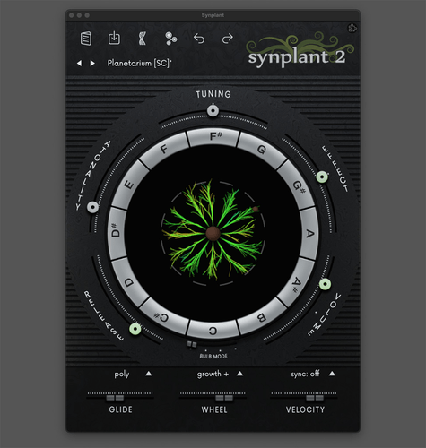
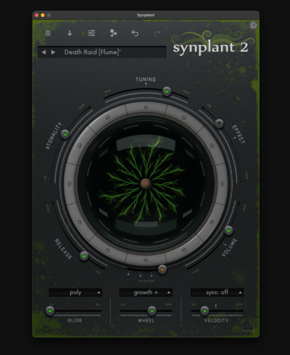
I've been working on a skin for synplan2 and here is a preview.
Looking at it myself I feel that it might be too dark. Not sure about the slider knob sizes either, should perhaps be bigger. Top menu just being clean icons and the prev/next for the preset feels good.
What do you guys think? I'm open for ideas and feedback.
Andy Music
It looks okay but atonality, release, velocity and effect should be horizontal. And font could be more rounded
Bru Franco
Looks nice! love it!
larserik
- Andy Music wrote:
It looks okay but atonality, release, velocity and effect should be horizontal. And font could be more roundedYeah, the way the letters are stacked for all but the tuning is a bit problematic. Horizontal (like the standard skin) is perhaps the way to go. The font might need to change to something that is mono spaced to work better with the "circle" path they are following. Thanks for your feedback.
- Bru wrote:
Looks nice! love it!Thanks!
Magnus Lidström
I like it too! It's fun with the flat touch-buttons look.
Can't wait to have some new skins for Synplant 2.
larserik
- Magnus Lidström wrote:
I like it too! It's fun with the flat touch-buttons look.
Can't wait to have some new skins for Synplant 2.Thanks, appreciate the feedback.
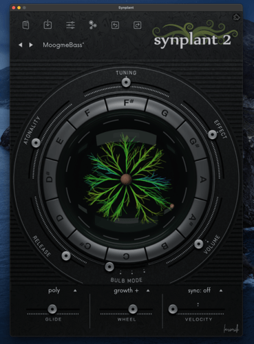
Latest progress with new fader knobs (same all over), new font with better alignment and a first version of the glass covering the plant. Also softer lighting and more metallic looking circular buttons.
Andy Music
Great progress!
Michael // MSLD
Oooh. This is very pretty. Great work!
NewLoops.com (Download Synplant 2 Pro Expansion Demo!)
- larserik wrote:
I've been working on a skin for synplan2 and here is a preview.
Looking at it myself I feel that it might be too dark. Not sure about the slider knob sizes either, should perhaps be bigger. Top menu just being clean icons and the prev/next for the preset feels good.
What do you guys think? I'm open for ideas and feedback.Looks great, a bit dark for me though. Lighter for my old eyes!
stelvio
It looks great!!! Great work.
larserik
- NewLoops.com (Download Synplant 2 Pro Expansion Demo!) wrote:
a bit dark for me though. Lighter for my old eyes!Yes I agree.
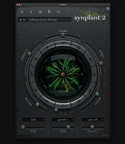
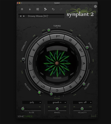
Been doing some u-turns with the design so it's currently more flat/clean looking and way brighter.
Josue Arias
nice!!
larserik
Getting closer to something completed. Aiming for a slight dirty and "organic" look.
Andy Music
If my opinion could be useful, I think that in this version sliders became too complicated with this bulbs. And rust takes too much attention here. Maybe it is my point of view but I think that organic feel should be as gentle as possible without taking attention from the core elements and information. But I love what you are doing!
Fredrik Lidström
Very nice. Did you manage to get the keyring animation working?
larserik
- Andy Music wrote:
If my opinion could be useful, I think that in this version sliders became too complicated with this bulbs. And rust takes too much attention here. Maybe it is my point of view but I think that organic feel should be as gentle as possible without taking attention from the core elements and information. But I love what you are doing!All opinions are welcome.
The bulbs are perhaps a bit too bright at their "max" right now, but I find they give very useful visual feedback. I've been trying out different kinds of animations but a led light, just like the original skin, is the only one that looks sane. How do you like the bulbs in the original synplant2 UI?
(This is an animated gif, you might need to click it to see the animation)
The grit and the dirt has been going back and forth and I've tried out various patterns and random overlays. (And I will continue iterate.) Since there's an option to zoom from very small to way huge the impact of dirt and "details" changes quite a lot. I agree with you that things like dirt and rust should not take attention from the core elements.
- Fredrik Lidström wrote:
Very nice. Did you manage to get the keyring animation working?Thanks, yes I was overcomplicating things in my little blender 3d-rig.
Andy Music
Nice animation! I think sliders fells a bit heavy because too much is going on here. Scale marks are bright and thick, bulb is changing, some text appears over an already existing text. Maybe there is to much accentuated information. I think that is what I feel. So if only core elements would make a simple bright geometry pattern and the other details are noticeable but doesn't stand out that could be a perfect solution!
larserik
- Andy Music wrote:
Nice animation! I think sliders fells a bit heavy because too much is going on here. Scale marks are bright and thick, bulb is changing, some text appears over an already existing text. Maybe there is to much accentuated information. I think that is what I feel. So if only core elements would make a simple bright geometry pattern and the other details are noticeable but doesn't stand out that could be a perfect solution!Ok, yes I get your point. It is a bit busy in the current state.
Fredrik Lidström
You can, kind of, do level-of-details by using all .png, _x2.png, and _x4.png variants. Not sure it's a good idea, but it is possible. 😊
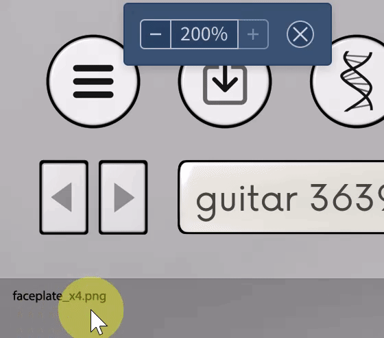
- larserik wrote:
Thanks, yes I was overcomplicating things in my little blender 3d-rig.Yeah, I'm using a pixel-diff animation for the keyring, so I think it makes it even harder to figure out what's going on just by looking at the default resources. Sorry for not making a template skin.
larserik
- Fredrik Lidström wrote:
You can, kind of, do level-of-details by using all .png, _x2.png, and _x4.png variants. Not sure it's a good idea, but it is possible. 😊
- larserik wrote:
Yeah, I'm using a pixel-diff animation for the keyring, so I think it makes it even harder to figure out what's going on just by looking at the default resources. Sorry for not making a template skin.
Thanks, yes I was overcomplicating things in my little blender 3d-rig.Seems to me the code and/or the libraries you are using to scale the UI does a very good job of keeping things looking good. And I'm only using x4 sizes at this state.
Regarding skin templates I would say that the github repo and information you provided about file names and sizes is more than enough. (Not to forget your Nightshift skin, that clears out most questions about what files where and what not.)
larserik
Final (or at least first) version of this skin won't be this look but I must say I do love the mold/dirt look in combination with the ridiculously clean center sphere + metal buttons and faders.
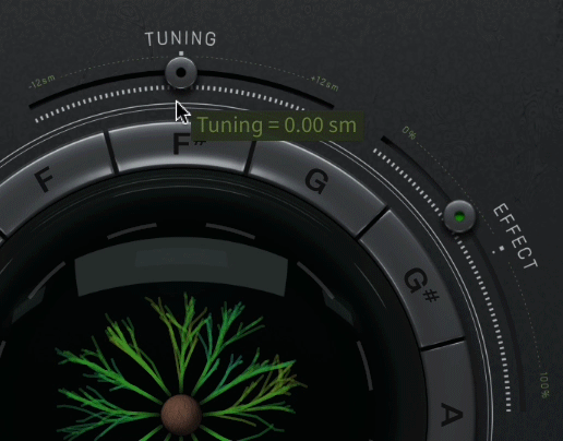
I removed the green thin dotted lines between min/max values of the circular faders. This looks way better imho.
And yeah, the bulb mode fader/switch has different colors in each of the 4 modes. Green, yellow, purple and orange (see above.)
Solidtrax
Very nice @larserik! Love it!
AAV
This is really nice!
Scribtide
Ohhhh this looks ace!! Would love to use this myself :D
larserik
- Solidtrax wrote:
Very nice @larserik! Love it!- AAV wrote:
This is really nice!- Scribtide wrote:
Ohhhh this looks ace!! Would love to use this myself :DThank you guys.
Progress has been somewhat slow. Will post some previews soon of the button animation and the layered mode.
larserik
Yesterday I got some work done with the circle buttons. Think I might need some iterations to get the details right but it's mainly there. I liked the layered bulb mode buttons so I decided to keep the design for the other bulb modes as well.
'
'
Here below an animation showing the toggle of standard and layered mode.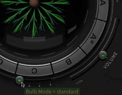
(You might need to click it to see the animation.)AAV
Incredible! Well done!
larserik
Here's a screen recording showing the greyone skin at it current state. Still some details here and there to tweak but main thing now is the colors for the dna and genopatch. Thinking I should go more green (removing the blue from the standard colors) and perhaps also less bright.
And yeah, I apparently need to make the circle buttons larger since the dice symbol does not fit the button.. Didn't see that until now when looking at the last second of the screen recording.
Fredrik Lidström
Very nice animations on the keyring. I like the concept of the physical lights not changing when switching bulb mode. But yeah, this makes the keyring behave a bit differently from the default skin where the keys are smaller in layered. What you can do is take a look at
keyRingLabels.ivg. At the very bottom of that file you have this section:radius = { $radius + ($mode=="layered"?8.5:5.5) } $prepare include "dice.ivg" for nr in:[$labels] [ // Draw dice context [ offset 0,-$radius scale {$mode=="layered"?0.85:1} $dice $nr $color ] rotate 30 ]larserik
- Fredrik Lidström wrote:
Very nice animations on the keyring. I like the concept of the physical lights not changing when switching bulb mode. But yeah, this makes the keyring behave a bit differently from the default skin where the keys are smaller in layered. What you can do is take a look atkeyRingLabels.ivg.Very helpful with the ivg, thank you. Might need to make the keyring buttons larger anyways to get the text in the other bulb modes to be more vertically centered.
Magnus Lidström
This looks so tasty @larserik!
And yes, editing and replacing .ivg files for a skin is possible, too. Just proceed with a bit of caution since we might fix .ivg bugs in Synplant updates. But as long as we only have a few skins, we can quickly check them for problems.
I made an IVG playground here for fooling around with IVG design: https://htmlpreview.github.io/?https://github.com/malstrom72/microtonic-scripts-sdk/blob/main/ivgfiddle/ivgfiddle.html
Documentation on IVG is here: https://github.com/malstrom72/microtonic-scripts-sdk/blob/main/docs/IVG%20Documentation.md
larserik
- Magnus Lidström wrote:
This looks so tasty @larserik!Thanks! :D
And yes, editing and replacing .ivg files for a skin is possible, too. Just proceed with a bit of caution since we might fix .ivg bugs in Synplant updates. But as long as we only have a few skins, we can quickly check them for problems.
I made an IVG playground here for fooling around with IVG design: https://htmlpreview.github.io/?https://github.com/malstrom72/microtonic-scripts-sdk/blob/main/ivgfiddle/ivgfiddle.html
Documentation on IVG is here: https://github.com/malstrom72/microtonic-scripts-sdk/blob/main/docs/IVG%20Documentation.mdI'm not sure I'm going to do any IVG changes, but really cool playground and examples!
larserik
So perhaps not that smart or bright and quite confusing I started another thread for the skin and it's here. Sorry about that.
https://soniccharge.com/forum/topic/2675-greyone-skin-for-synplant2?~post13776
You need to be signed in to post a reply