Wakapedia
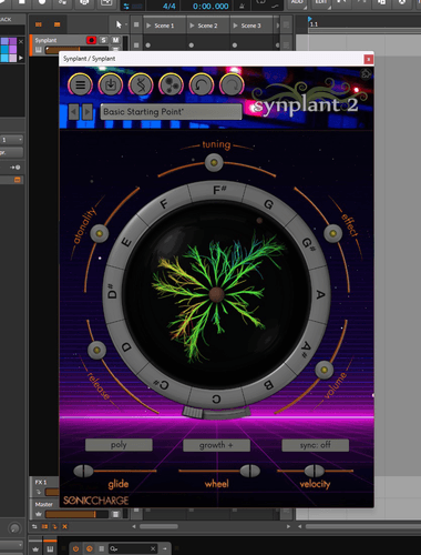
New to skinning on synplant 2 and using photopea online. Started a Synthwave/Outrun style theme working off the Nightshift dark theme.
So far I've only made the main window using some 3d synthwave lines and a top down picture of my microKorg synth. I also made the name match the background so it doesn't show for people who make content and don't want to show their name (can we change from an IRL name to a handle?)
Feels like the oldschool winamp skinning days but might be a bit too busy like some of them as well but I can post it here later once I'm finish and it is something ppl would use!
Joey Luck
Fun! :)
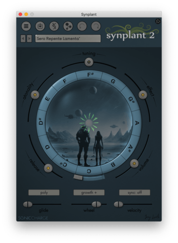
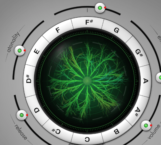
I was also wondering what ideas some people might come up with inside the bulb (with some transparency). I was just messing around with some images I found (not mine), making the seed look like a planet
Karschnackelwackel
Great skins guys :) Keep up, I'm looking forward to more. I love the synthwave skins header and the idea with the planet as seed is awesome.
I know my Photoshop basics, but am not into programming at all. Is it hard to do that? Is coding needed for creating skins or is it more a process of just replacing existing images in folders?
Wakapedia
Mostly just replacing images but there's some CSS(?) work for font colours and such which is mostly just replacing colour codes. Like below in the skin folder there's a text file and I edited the BALLPOINT_PEN_COLOR to be 040309 to match the background so you can't see the account owner's name and it blends in but could easily change to another one to see it
@define MAIN_DISPLAY_TEXT_COLOR = #111111
@define MAIN_BALLPOINT_PEN_COLOR = #040309Karschnackelwackel
I see, actually sounds doable. Thanks, I may take a look into that if I come up with an idea.
JBDS1
Joey Luck
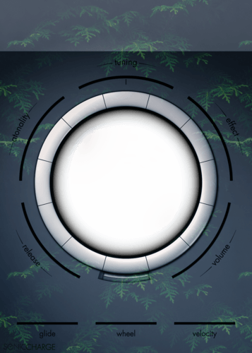
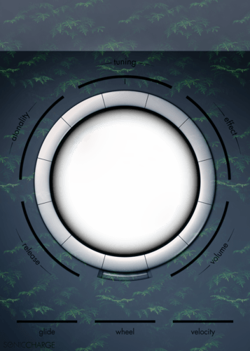
@JBDS1 looks nice!
Fredrik Lidström
🔥
larserik
Here's a preview of what I'm working on currently. Not sure about colors, materials and lighting just yet but the basic shapes of things is done.. I think.
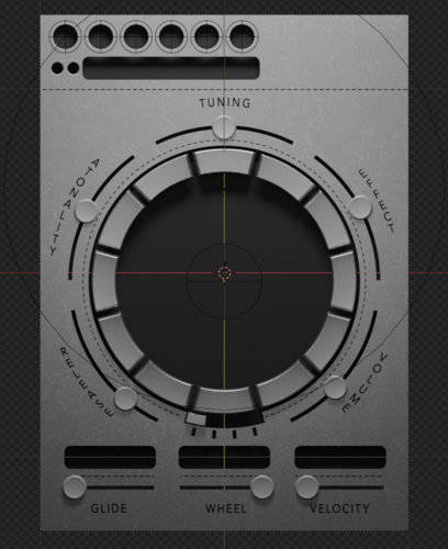
.
.
Does this look like green candy or like green-water-outbreak-in-your-aquarium? I was going for the latter.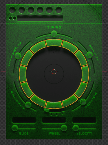
larserik
- Joey Luck wrote:
Fun! :)
I was also wondering what ideas some people might come up with inside the bulb (with some transparency). I was just messing around with some images I found (not mine), making the seed look like a planetI was thinking a radar-thingy-look for the transparency. or perhaps an oscilloscope ?
stelvia
Synplant screams for a Stargate skin no?
Is there a tutorial on how to create skins?Tomasz Gorzelak
- larserik wrote:
Here's a preview of what I'm working on currently. Not sure about colors, materials and lighting just yet but the basic shapes of things is done.. I think.
.
.
Does this look like green candy or like green-water-outbreak-in-your-aquarium? I was going for the latter.Gray one is sick!! Finish it please :)!
larserik
- stelvio wrote:
Synplant screams for a Stargate skin no?Yup, a Stargate skin must be made.
Is there a tutorial on how to create skins?
There is a github repo with all the details. https://github.com/fredli74/synplant-skins
Joey Luck
@larserik looks cool!
Yeah I was also thinking an aquarium would be cool, maybe also with a few fish :)
Or maybe a submarine window.
stelvia
There is a github repo with all the details. https://github.com/fredli74/synplant-skins
thanks!
Andy Music
But maybe washing machine??
Marcus Timm
- larserik wrote:
Here's a preview of what I'm working on currently. Not sure about colors, materials and lighting just yet but the basic shapes of things is done.. I think.
I WANT IT! Please finish this one and release it here, PLEASE. 💯🔥
c0nsilience
HAL 9000 from 2001? 😉
Manuel Senfft
Give the people the option to skin the tool ... and suddenly new skins arise from the ground. Cool, haha! :D
larserik
Some progress here and there. Really happy with making the patch display include the previous/next patch arrows, that cleaned up the UI quite a bit.
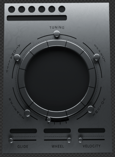
In use having green text (that matches the center plant) it kind of looks cool. Don't think having this dark and moody lighting is something that will work. (This is a 3d render, and chopping up elements into sprites things like long shadows is a total headache.)
Dennis Treiber
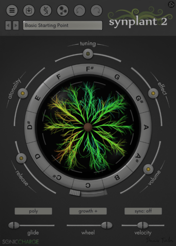
Took the Nightshift skin and tweaked the labels to be light.
There's some texture thing still going on near them, but was still okay for me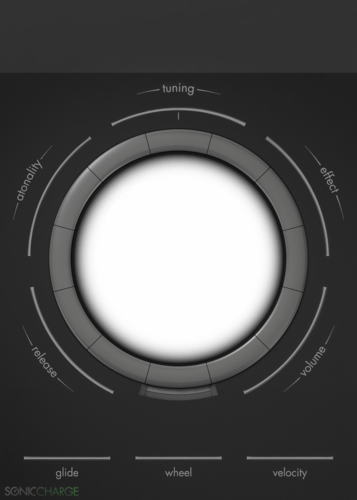
Manuel Senfft
Nice, thank for sharing!
EnochLight
- larserik wrote:
Here's a preview of what I'm working on currently. Not sure about colors, materials and lighting just yet but the basic shapes of things is done.. I think.
.
- larserik wrote:
Some progress here and there. Really happy with making the patch display include the previous/next patch arrows, that cleaned up the UI quite a bit.
In use having green text (that matches the center plant) it kind of looks cool. Don't think having this dark and moody lighting is something that will work. (This is a 3d render, and chopping up elements into sprites things like long shadows is a total headache.)
These are magnificent - please finish them! I'd love to have these skins!~
larserik
- EnochLight wrote:
These are magnificent - please finish them! I'd love to have these skins!~Thanks for the kind words. I'm aiming to finish something.
NewLoops.com (Download Synplant 2 Pro Expansion Demo!)
- larserik wrote:
Some progress here and there. Really happy with making the patch display include the previous/next patch arrows, that cleaned up the UI quite a bit.
In use having green text (that matches the center plant) it kind of looks cool. Don't think having this dark and moody lighting is something that will work. (This is a 3d render, and chopping up elements into sprites things like long shadows is a total headache.)Oh nice!
Nebulae
Love these skin ideas!
Nebulae
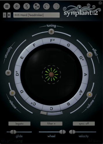
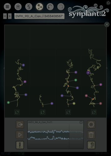
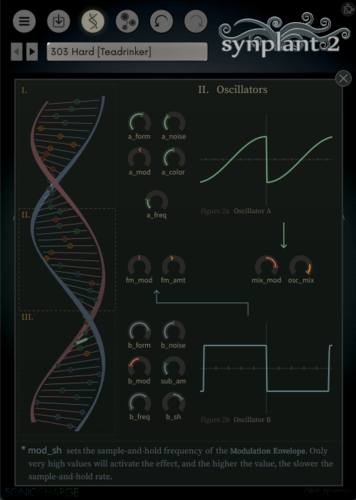
I created a darker mod of the Nightshift theme with more contrast, and using Dennis's light faceplate. Have at it: https://www.dropbox.com/scl/fi/7srrsaj90t0qtqjg34vq8/Nightshift-Nebulae.zip?rlkey=k08c1y7qvp8gnx34oa048ikyb&dl=0
Manuel Senfft
Nice! Thanks for sharing.
Sun Juice
- Joey Luck wrote:
Fun! :)
I was also wondering what ideas some people might come up with inside the bulb (with some transparency). I was just messing around with some images I found (not mine), making the seed look like a planetVery cool,I like the central part
You need to be signed in to post a reply