Arne Heyna
Dear SonicCharge team,
Synplant 2 - long awaited - much appreciated!
But now that we have the indredible possibility of having access to an AI inside a synth plugin, are there any plans to upgrade the browser to a more sophisticated one - not an endless list that your mouse button takes you through from A to Z in what feels like half an hour, but a more full-fledged one, with filter options (sound types, style, author...), favourites and improved overall usability and design?
Or am I missing something?All the best
ArneJoey Luck
Are you using the patch file browser at all? There are different sub folders to browse by (Package, Category, Creator, All).
Some other features in case you missed them:
While the patch file browser is open, you can preview patches before loading them by sending MIDI while browsing.
There's also two handy buttons at the bottom of the file browser to quickly navigate to factory patches and user patches.
Another new feature is the ability to randomly load a patch by clicking on the patch display while holding Command/Control. It will choose a patch from the currently selected folder. I like to use it while the current folder is set to All.
NewLoops.com (Download Synplant 2 Pro Expansion Demo!)
I also thought this needs a proper preset browser. Look at U-he synths for some inspiration, and do something like that! :)
Audio Voltage
Some other features in case you missed them:
While the patch file browser is open, you can preview patches before loading them by sending MIDI while browsing.
There's also two handy buttons at the bottom of the file browser to quickly navigate to factory patches and user patches.
Another new feature is the ability to randomly load a patch by clicking on the patch display while holding Command/Control. It will choose a patch from the currently selected folder. I like to use it while the current folder is set to All.You must have a different GUI version than me, there is absolutely no file browser visible here. Could you please post a screenshot of it? And I also have zero presets in Synplant 2. But this has always been an issue with all Sonic Charge products for me, I´ve never ever had a single preset automatically installed after installing the plugin properly.
Manuel Senfft
I guess that with patch file browser he might be refering to the default system file browser. At least I guess that Sonic Charge plugins use system standard file browser for opening patches (when not chosen through the plugins drop down list).
Edit: Oh and you can open this file browser when choosing Browse Patched... from the drop down list (the first entry, basically).
Jasper Helderman
it is indeed confusing, it show's the custom user patches as default located in a documents folder while the extra presets from the download page are installed into the program files folder, which there is no way to actually access them easily or setup a default browsing folder for it.
Idk if this is intended but i agree the browser system needs a re-design.
Joey Luck
Yes, that's the browser I mean. You can get to it by either choosing 'Browse Patches...' (after clicking the patch display) or from the menu button, 'Open Patch'
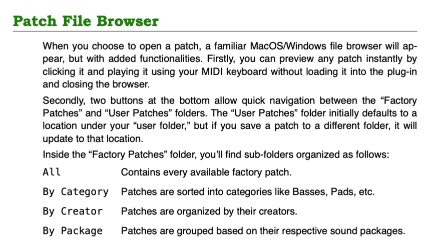
You can quickly navigate to the factory patches by clicking the "Go to Factory Patches" button at the bottom
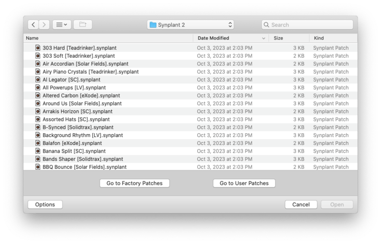
That will take you here, where you can browse by these subfolders
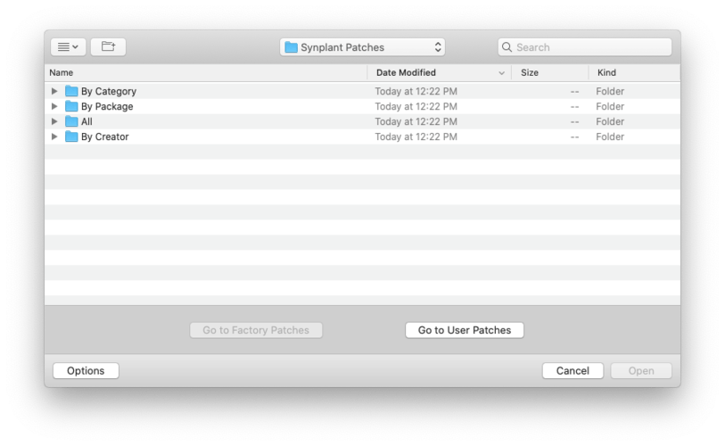
Arne Heyna
I'd love to hear the developer on my initial question!
NextDAW
- Jasper Helderman wrote:
it is indeed confusing, it show's the custom user patches as default located in a documents folder while the extra presets from the download page are installed into the program files folder, which there is no way to actually access them easily or setup a default browsing folder for it.
Idk if this is intended but i agree the browser system needs a re-design.I would personally prefer it, if all presets were located into one consolidated location, such as
..\Documents\Sonic Charge\Synplant\Presets\
\Factory Presets\
\User Presets\
\Shared Presets\
\Preset Packs\
etc.
A further developed Preset Menu system, could also allow for more 'advanced tagging' of presets and searching and sorting by tags (rather than just sorted by folder location). In addition to a much needed ability (imho) to quickly tag specific presets as 'favourites', etc.
I do also wonder if the advanced AI used for genopatch, could also be utilized to automatically tag specific sounds as they are created within the plugin? Since, it is so good at imitating its generated sound-alike patches, could it be extended to add tagging information accordingly? Which users might then be able to search/sort presets by?
mhprf
Is this a Windows vs. Mac issue?
On my Macbook, Synplant 2 has a nice patch browser. If I choose Browse Patches I can then choose the Factory bank or my User bank. In my User bank I can organize patches how I'd like. If I choose the Factory bank I can browse patches by instrument type or by creator etc. (BTW, thanks for the excellent patch bank to download!)
I like to be able to star or add favorite patches to end up in a favorites folder. I haven't found that feature in Synplant 2 (could be my error). But if that feature is not there, that would be the only thing I would say could be improved.
Karschnackelwackel
A good patch browser is always welcome, but somehow I like Sonic Charges take with their use of the OS-file explorer too. It has something nostalgic. And with auto preview on I can navigate through files and subfolders using the error keys+enter, so actually pretty comfortable. All the Sonic Charge vsts use that and I almost assume it's a choice with a philosophy behind, and not just something that has not found its way into their tools yet for technical reasons.
NextDAW
- Karschnackelwackel wrote:
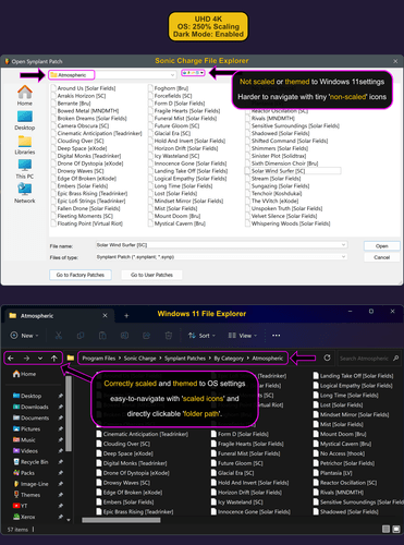
A good patch browser is always welcome, but somehow I like Sonic Charges take with their use of the OS-file explorer too. It has something nostalgic. And with auto preview on I can navigate through files and subfolders using the error keys+enter, so actually pretty comfortable. All the Sonic Charge vsts use that and I almost assume it's a choice with a philosophy behind, and not just something that has not found its way into their tools yet for technical reasons.However, currently the Sonic Charge customized version of Windows File Explorer is not correctly using the Windows 11 OS' scaling or theme settings.
For example, I have a UHD 4K display, with Windows 11 set to '250% scaling' and 'Dark mode'.
But Sonic Charge plugins ignore those OS settings and instead use '100% scaling' and 'Light mode'.I know it's possible to use the OS settings for Windows 11 File Explorer, since many other apps and plugins do match the OS settings.
The 'Dark mode' I could perhaps live without, even though it would be nice to have it match the rest of my OS settings. But the non-scaling Sonic Charge File Explorer is a more troublesome issue at 4K UHD, since the icons to navigate around parent folders, etc. are so small at 100% scaling, that you have to be 'pixel perfect' when clicking, or else you can easily accidentally click the wrong one.
See the following comparison image between the custom Sonic Charge File Explorer, compared to a correctly scaled and themed Windows 11 File Explorer. The latter, being far easier to navigate and use.
NewLoops.com (Download Synplant 2 Pro Expansion Demo!)
Hoping for some comment on this.
Arne Heyna
Dear all,
thanks for all your replies and contributions on this topic! (By the way, I don´t find "Are you using the patch file browser at all?" not helpful when asking for a browser upgrade.)
I´m on Windows (10), and unfortunately I still did not happen to have the chance to check Synplant 2 on macOS, since some of you share screenshots from the MAC perspective. However, they basically don´t look that different to the Windows situation (see attachment).
I´m aware that the current situation has a bit more to offer than just scroll through this long list: I could also choose other file paths and scroll through different (mostly shorter, because filtered) patch lists.After all, it is just an OS-browser-based search, which may cause a charmingly nostalgic feeling, but at the same time is far away from giving the opportunity to organize things. And since I think Synplant 1 already was a very great synth - with the potential of providing all sounds for whole tracks - in the long awaited upgrade to v2 I´d like to see the sophisticated engine to be accompanied by an adequate browser.
Synplant is foremost meant for organic sound creation, but I also like to be able to manage good results by category filters, favourites and so on.I´m still missing a word from the delevoper´s perspective.
Best
Arne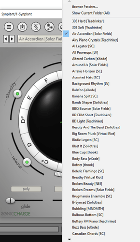
NewLoops.com (Download Synplant 2 Pro Expansion Demo!)
It takes me about 6 clicks and scrolling/looking for folders just to change preset in a different category. This really needs to be improved with a proper preset browser. Really hoping the devs can respond soon? :)
Joey Luck
I only asked if you were using the file browser because you mentioned scrolling an endless list and features that are a part of the file browser (such as browsing by creator or sound type). I'd be happy to see a new browser too with patch favoriting :) But I simply didn't know if you were aware of the updates to the current browser and preset organization that was just done for Synplant 2. I don't use the dropdown for most plugins, I prefer to open the browser. But now, I've been leaving the preset folder selected as "All" and Command-clicking on the patch display to load random patches. That's been the most fun for me in terms of browsing patches with Synplant 2.
AEAEA
In bitwig 5 - Windows 10, when clicking the display when holding control it doesnt chose a random patch, it just opens the menu like when normally clicking it. Any ideas?
Magnus Lidström
- AEAEA wrote:
In bitwig 5 - Windows 10, when clicking the display when holding control it doesnt chose a random patch, it just opens the menu like when normally clicking it. Any ideas?Sorry, it is a bug in Synplant. It simply doesn't work on Windows. It will be fixed in the upcoming 2.0.1 update.
AEAEA
Nice one, looking fwd to it.
And thanks alot for Synplant 2 - The best synth since ages!!Magnus Lidström
- NextDAW wrote:
See the following comparison image between the custom Sonic Charge File Explorer, compared to a correctly scaled and themed Windows 11 File Explorer. The latter, being far easier to navigate and use.
This issue should hopefully be remedied in version 2.0.1 that we just uploaded to https://soniccharge.com/download. Please try it.
AEAEA
Great news! Thanks for the hard work! Will try it out ASAP.
NextDAW
- Magnus Lidström wrote:
- NextDAW wrote:
This issue should hopefully be remedied in version 2.0.1 that we just uploaded to https://soniccharge.com/download. Please try it.
See the following comparison image between the custom Sonic Charge File Explorer, compared to a correctly scaled and themed Windows 11 File Explorer. The latter, being far easier to navigate and use.
Yes! The Windows file explorer preset browser integrated within Synplant 2.0.1 now scales correctly and is even themed properly (i.e. matching with the Windows 11 system settings). 😊👍
This now makes preset navigation and using the Synplant 2.0.1 browser FAR easier on Windows within an 4K UHD setup, than it was previously. Thank you very much for implementing this.
Would it be possible to also fix the same 'non-scaling' browser issue for other Sonic Charge plugins in some future update? Predominantly, for microtonic, which due to the nature of the plugin, often requires a lot of browser use (i.e. whenever selecting, loading/saving drum samples.) Because, that too would be most appreciated and would likewise improve the preset browser experience for microtonic greatly.
Thanks again!
stelvia
For all those struggling with the strange browser, I just found out we can drag and drop presets from the Finder onto the VST. That's something. I now organize my presets in the Finder instead.
Nicholson Percy
It would be wonderful if the developer could respond to my original inquiry.
Fredrik Lidström
- Nicholson Percy wrote:
It would be wonderful if the developer could respond to my original inquiry.Which was?
You need to be signed in to post a reply