larserik
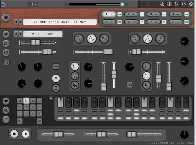
Trying out some button designs for the darkTw0 skin.
Green is a better color then red blinking buttons right?
philter
- LarsErik wrote:
Trying out some button designs for the darkTw0 skin.
Green is a better color then red blinking buttons right?....hard to say if it is really "better" than red, but often it fits definitely better to
a green-themed skin imoChristian F.
- LarsErik wrote:
Green is a better color then red blinking buttons right?I vote yes!
And tbh red AND green blinking buttons were bothering me a bit.philter
- Christian F. wrote:
- LarsErik wrote:
I vote yes!
Green is a better color then red blinking buttons right?
And tbh red AND green blinking buttons were bothering me a bit.what about some nice shiny white leds :)
Manuel Senfft
- LarsErik wrote:
Trying out some button designs for the darkTw0 skin.
Green is a better color then red blinking buttons right?Personalyl I also find green better than red ... but also think about orange ... black + orange can look so cool! (-;
larserik
- Christian F. wrote:
- LarsErik wrote:
I vote yes!
Green is a better color then red blinking buttons right?
And tbh red AND green blinking buttons were bothering me a bit.Yes I agree.
- philter wrote:
what about some nice shiny white leds :)I've tried and failed making led lights in blender so many times. When I did skins for ABL3 I was almost going crazy trying but I gave up. Went for white/red dots instead: https://l4rs3rik.github.io/abl/
But it's a good idea, if I just can figure out a way to make them. :D
- Manuel Senfft wrote:
Personalyl I also find green better than red ... but also think about orange ... black + orange can look so cool! (-;Oh yeah, orange is a really nice color for backlit buttons on dark gear..
philter
- Manuel Senfft wrote:
Personalyl I also find green better than red ... but also think about orange ... black + orange can look so cool! (-;
hell yeah, black and orange , i love it when theese two colors have a date:)
Christian F.
Ahem, I hope you don't mind ;)
Btw, there is something wrong with the behavior of the small buttons like accents etc.
The button-press frame stays on until the running indicator has run past them.larserik
- Christian F. wrote:
Ahem, I hope you don't mind ;)Not at all. Go wild!
Btw, there is something wrong with the behavior of the small buttons like accents etc.
The button-press frame stays on until the running indicator has run past them.Thank you for noticing that. Yes you are right, there is something weird going on with the the smaller buttons.
philter
- LarsErik wrote:
I've tried and failed making led lights in blender so many times. When I did skins for ABL3 I was almost going crazy trying but I gave up. Went for white/red dots instead: https://l4rs3rik.github.io/abl/
But it's a good idea, if I just can figure out a way to make them. :Di make my leds (like all my other knobs,switches and buttons) in knobman.
it is really great for doing that, not only that it has lots of options for modeling the led itself
(ambient lighting, inner and outer shadows, emboss for shapes, diffuse etc...)
but it also has everything to make that led animated (if you want more than just the on and off state) or batch-export multiple different color/size variations of your led with one click.edit: just tried uploading a small preview gif animation of one of the leds but seems like
the animation does not work when i attach the gif file to my post. also tried linking to the gif file on my google drive, but same here, the animation does not work inside the forum, so here is the link.
it´s nohing special, just a small example.https://drive.google.com/file/d/1TOME3gMXfPx946Ni3x14VlH9y6GVuWWy
philter
_- LarsErik wrote: When I did skins for ABL3 I was almost going crazy trying but I gave up. Went for white/red dots instead: https://l4rs3rik.github.io/abl/
WOW, that stuff looks sexy as hell LarsErik !
larserik
- philter wrote:
_- LarsErik wrote: When I did skins for ABL3 I was almost going crazy trying but I gave up. Went for white/red dots instead: https://l4rs3rik.github.io/abl/
WOW, that stuff looks sexy as hell LarsErik !Thanks.
- philter wrote:
- LarsErik wrote:
I've tried and failed making led lights in blender so many times. When I did skins for ABL3 I was almost going crazy trying but I gave up. Went for white/red dots instead: https://l4rs3rik.github.io/abl/
But it's a good idea, if I just can figure out a way to make them. :D>i make my leds (like all my other knobs,switches and buttons) in knobman.
it is really great for doing that, not only that it has lots of options for modelingOk, I see. I need to try knobman, seems like a very potent tool to have.
larserik
- LarsErik wrote:
- Christian F. wrote:
Not at all. Go wild!
Ahem, I hope you don't mind ;)Btw, there is something wrong with the behavior of the small buttons like accents etc.
Thank you for noticing that. Yes you are right, there is something weird going on with the the smaller buttons.
The button-press frame stays on until the running indicator has run past them.I'm going to give the dark skin some love this weekend. The smaller buttons is something that I need to fix, and then there's some other minor things like the hue of the pattern select buttons and the icons on the menu buttons are to sharp.
philter
Ok, I see. I need to try knobman, seems like a very potent tool to have.- LarsErik wrote:
at least it covers everything you need when it comes to creating knobs,buttons,switches, vu´s,
leds and that kind of stuff, but you can also use it for completly other things, possibilites are endless . you can import&extract existing image strips but also morph allmost EVERY parameter between two or even more values linear or via seperate, customizable curves ).
the only "limit" is that is that the maximal size of a single frame in your knobman project is 512x512 pixel, which is more than enough for most of the user interface elements in my caselarserik
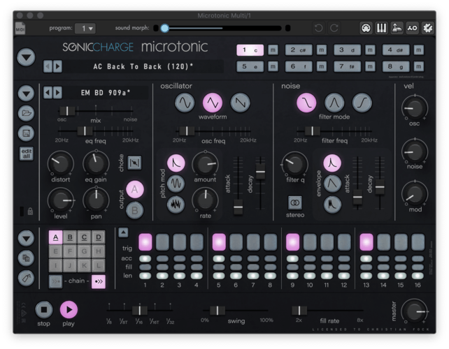
Here's a preview of the next update to the dark0ne.
Thanks to Manuel Senfft and philter for suggesting and cheering on for orange + black and to Christian F for noticing the sequencer button weirdness.
Changes:
- Only two main colors, orange and white for all buttons. (Except for the mute buttons, they still go red when a channel is muted.)
- Logo and morph controls are matched in orange color tones.
- Menu icons are copied from the tonicA skins.
- Only one color for the pattern select buttons.
- The small sequencer buttons (accent, len and fill) are bugfixed and the graphics is pretty much remade from scratch.
- Matrix editor background is now blue/gray instead of green and the matrix notes are orange.
Manuel Senfft
Woaaa. * . * ... probably my next default skin, haha. Very beutiful and thanks for listening to us! <3
Christian F.
Thank you so much LarsErik for making the best drum machine of all time even more enjoyable!
philter
- LarsErik wrote:
Here's a preview of the next update to the dark0ne.
Thanks to Manuel Senfft and philter for suggesting and cheering on for orange + black and to Christian F for noticing the sequencer button weirdness.
Changes:
- Only two main colors, orange and white for all buttons. (Except for the mute buttons, they still go red when a channel is muted.)
- Logo and morph controls are matched in orange color tones.
- Menu icons are copied from the tonicA skins.
- Only one color for the pattern select buttons.
- The small sequencer buttons (accent, len and fill) are bugfixed and the graphics is pretty much remade from scratch.
- Matrix editor background is now blue/gray instead of green and the matrix notes are orange.WOOHOO i love it! thx!
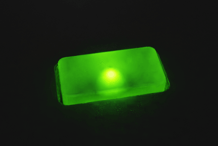
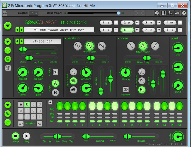
here is a small preview of some skins i am working on.
what do you guys think?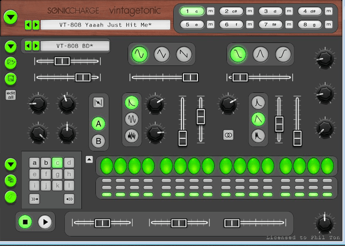
larserik
- Manuel Senfft wrote:
Woaaa. * . * ... probably my next default skin, haha. Very beutiful and thanks for listening to us! <3- Christian F. wrote:
Thank you so much LarsErik for making the best drum machine of all time even more enjoyable!- philter wrote:
WOOHOO i love it! thx!You welcome guys. Without feedback, discussions and suggestions pushing pixels can be very boring. So thank you right back.
Christian F.
OK then, there is still weirdness with the small buttons and the pattern selection section.
Try chaining a couple of patterns and then selcting/deselecting the pattern.
The background goes dark after deselecting and changes after the blinking cursor moves past.Edit: I'm talking about the brand new orange one.
larserik
- philter wrote:
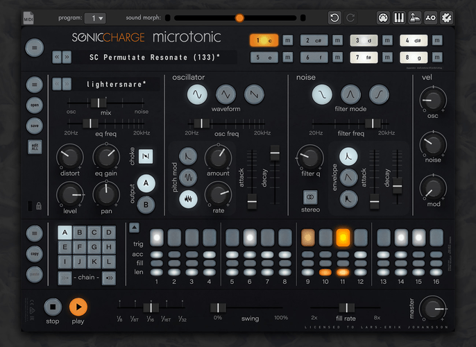
here is a small preview of some skins i am working on.
what do you guys think?The glowing green skin is nice. Alien glowing green. Perhaps the background needs to be darker to make the labels show more? I like the green sliders better then the inverted ones.
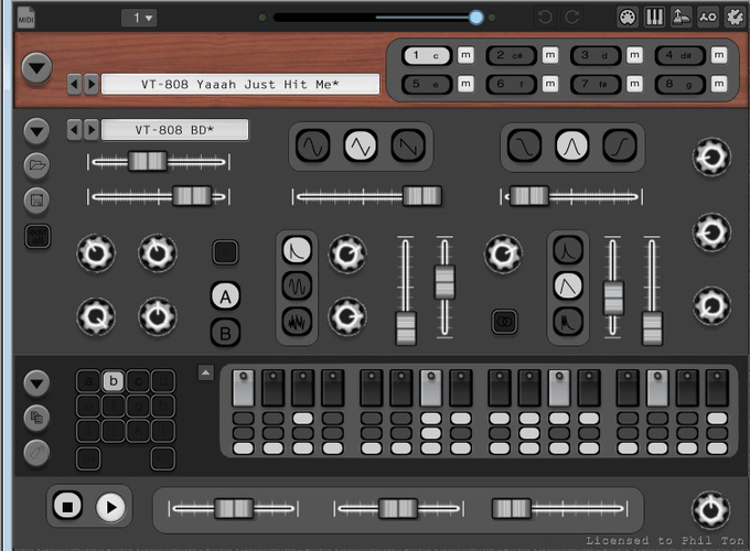
Screenshot #4: I like the sequencer buttons. Good solid sequencer buttons. The menu buttons on the left side of the UI has a tad to much drop shadow for my taste, makes the buttons look like they are floating and not sitting onto the UI. Looking forward seeing the progress on the sequencer button leds on this one. Oscillator waveform and noise filter mode buttons are really nice, reminds me of the Moog Sub Phatty-buttons with that dark framing.
larserik
- Christian F. wrote:
OK then, there is still weirdness with the small buttons and the pattern selection section.
Try chaining a couple of patterns and then selcting/deselecting the pattern.
The background goes dark after deselecting and changes after the blinking cursor moves past.
Edit: I'm talking about the brand new orange one.ok, I'll take a look.
larserik
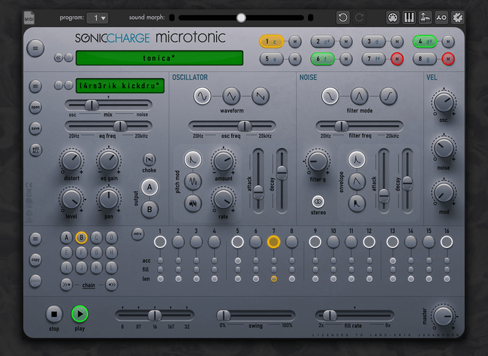
dark0ne version 2.0.2
Thanks Christian F for your help and your feedback.
Changes are
-Square button changes to make it more consistent. This makes the pattern select buttons less confusing.
-Sequencer small button consistency update (selected and played are same graphics) and the buttons have better graphics with button led showing more.
-Matrix editor background is now darker.
-
Pull request is made to fredli74/microtonic-skinsChristian F.
No, thank you LarsErik! I swear microtonic even sounds better ;)
Manuel Senfft
- Christian F. wrote:
No, thank you LarsErik! I swear microtonic even sounds better ;)True that! :D
larserik
- Christian F. wrote:
No, thank you LarsErik! I swear microtonic even sounds better ;)- Manuel Senfft wrote:
True that! :DLOL!
larserik
I pushed my last pixels of the dark0ne, tonicA, tonicB and tonicR skins yesterday. Bugfix on the dark0ne "edit all" button and small tweaks to the backgrounds on the other skins.
philter
SinTonic Skin by philton.zip(4.15MB, 459 downloads)
...almost there....
this skin isn´t finished yet , but here is an early version that you can try and, maybe ,give me some suggestions what could be optimized
EDIT: oops, completely forgot the labeling stuff in this one hehe, will upload the fixed skin asap ;)larserik
I'm not able to try it out in a couple of days but I like what I see on this screenshot.
larserik
- LarsErik wrote:
I'm not able to try it out in a couple of days but I like what I see on this screenshot.Now I've tried it out for a while. I like what you have going here. When will you update with the labels?
philter
hey, glad you like it! unfortunately i haven´t finished the skin yet, have been working on another one instead, i used your "dark0ne" skin as basic template, hope thatßs fine!
...but now that my "clockwork orange" skin is complete i will have a look at the labeling again.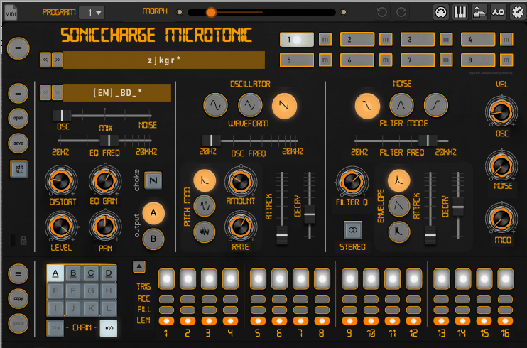
clockwork orange.zip(2.69MB, 492 downloads)philter
- LarsErik wrote:
- LarsErik wrote:
Now I've tried it out for a while. I like what you have going here. When will you update with the labels?
I'm not able to try it out in a couple of days but I like what I see on this screenshot.here is the updated version of the skin, including labels. it´s optimized for zoom level above 150%, everything below 150% zoom looks ugly but i will work on that. maybe it´s just me but labeling a skin is kinda hard for me hehe....
SinTonic Skin for SonicCharge Microtonic by Philipp Ruppel.zip(3.27MB, 525 downloads)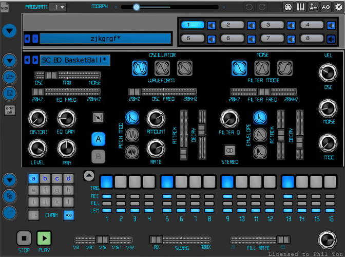
Christian F.
^^
Cool! Even better without labels if you ask me.larserik
- Christian F. wrote:
^^
Cool! Even better without labels if you ask me.Yes I'm also thinking the one without the labels has a "better" look. More gray all over.
larserik
- philter wrote:
hey, glad you like it! unfortunately i haven´t finished the skin yet, have been working on another one instead, i used your "dark0ne" skin as basic template, hope thatßs fine!
...but now that my "clockwork orange" skin is complete i will have a look at the labeling again.
clockwork orange.zip(2.69MB, 492 downloads)I like it. Reminds me of a Winamp skin I used to have back in the day.
- philter wrote:
- LarsErik wrote:
here is the updated version of the skin, including labels. it´s optimized for zoom level above 150%, everything below 150% zoom looks ugly but i will work on that. maybe it´s just me but labeling a skin is kinda hard for me hehe....- LarsErik wrote:
Now I've tried it out for a while. I like what you have going here. When will you update with the labels?
I'm not able to try it out in a couple of days but I like what I see on this screenshot.
SinTonic Skin for SonicCharge Microtonic by Philipp Ruppel.zip(3.27MB, 525 downloads)Labels is a lot of work yes.. I spent so many hour pushing labels around trying to make stuff look like they are aligned properly in the different zoom levels of the UI. But since the graphics (knobs and buttons) move around even so slightly depending on the zoom level it can get very tedious.
I would like to try making labels on the skin you shared on the 1 of April. Is that ok with you philter?
philter
- LarsErik wrote:
I would like to try making labels on the skin you shared on the 1 of April. Is that ok with you philter?
of course!
Joey Luck
I'm really enjoying all of the additional skins that people have been making! Really great stuff!!
That said, I do still find myself switching back to the factory one by Fredrik :) It's just so great! 👍
I guess what I would like to see, is a more "real-life" version of the factory skin. So the same knobs and buttons, but more 3D, with more texture, an adjustment to lighting, etc. Perhaps it's the dark outlines around the buttons and knobs of the factory skin that also play a part in making it appear a little more like a drawing? I like it though and have always been a fan! I'm just curious what someone might be able to do imagining what an exact Microtonic would look like as real-life hardware with the same controls.
larserik
Here's what I'm working on, very early so lots can and will change.
Manuel Senfft
Wow ... just beautiful again. <3
Christian F.
Wow, can't wait, looks delicious. I can practically feel these buttons just by looking at them!
Bert Friedrich
- LarsErik wrote:
Here's what I'm working on, very early so lots can and will change.Amazing, very nice!!!
larserik
- Manuel Senfft wrote:
Wow ... just beautiful again. <3- Christian F. wrote:
Wow, can't wait, looks delicious. I can practically feel these buttons just by looking at them!- Bert Friedrich wrote:
Amazing, very nice!!!Thanks guys, I appreciate it.
larserik
tonica verion 2.0 - Updated slider graphics, lower buttons (shorter shadows) and some other minor adjustments.
-
I've also done some housekeeping so when the pull request gets merged the boring and dull blue and red versions of the tonica will be removed.Serg.E
Hi everyone. after a long test phase of microtonic, i decided to get my own license. it could be that the skin renewal will be included in the next update. First I needed time to find out that the skins only fit the beta version. now everything works.
Definitely great work on the part of developers and enthusiasts who contribute their work to improve this fat drum synth.(translated by google)
Man liest sich noch ^^
Andrew Atkinson
@LarsErik - just wanted to say thanks for the skins you've produced. Excellent work.
larserik
I think I'm done now, for real this time. Latest pull request into the skins repository contains polished and adjusted final versions of tonica and dark0ne.
-
-
darkone
Removed stickers and texts and the kensington lock. Added "darkone" logotype.
-
-
tonica
Corrected an error in the sequencer button graphics and added more lines between the different parts of the UI to tidy up the look and feel. Especially happy how that cleared up the look and feel of the sequencer section. And yeah, an tonica-logotype is also added.
electronic drum
Good ideas and improvements, LarsErik! I agree with you on the sequencer section looking clearer!
Your new white skin posted above also looks very cool!
Thanks again for sharing your ideas and work!
Nathan Talsma
@Fredrik Lidström - Vintage Tonic Skin looks awesome, I really love MicroTonic I'm often recommending it to friends.
Nathan Talsma
The green and grey looks awesome too, really pops
Mike Overdijk
Wow just found this thread. Long time microtonic Owner here. Love the skin options!!! Thanks for sharing, everyone!
Mike Overdijk
- LarsErik wrote:
Here's what I'm working on, very early so lots can and will change.Looks promising!
philter
- LarsErik wrote:
I think I'm done now, for real this time. Latest pull request into the skins repository contains polished and adjusted final versions of tonica and dark0ne.wow that looks awesome!
Fredrik Lidström
It's getting close to wrapping this beta up. Big thanks go out to everyone for testing!
If you want your skin included in the official installer by launch date, please submit it no later than Sunday
2021-06-132021-06-27Fredrik Lidström
Inspired by the reference skin that LarsErik posted a screenshot of many months ago, I decided to change the template skin found on GitHub to something more useful.
I have included the PSD source files for everything, where the factory images are in a (sometimes hidden) layer. Maybe they will come in handy for people that use Photoshop. Like the super simple "Smart Object" knob rotation.
electronic drum
Thanks a lot, Fredrik. That is indeed a great help!
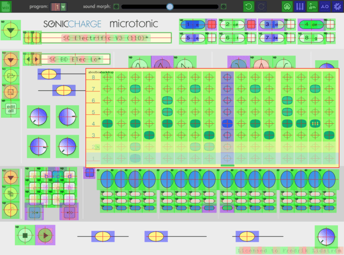
Unfortunately, though, I still find these inconsistencies
(regarding knob alignment) in the skin (see picture).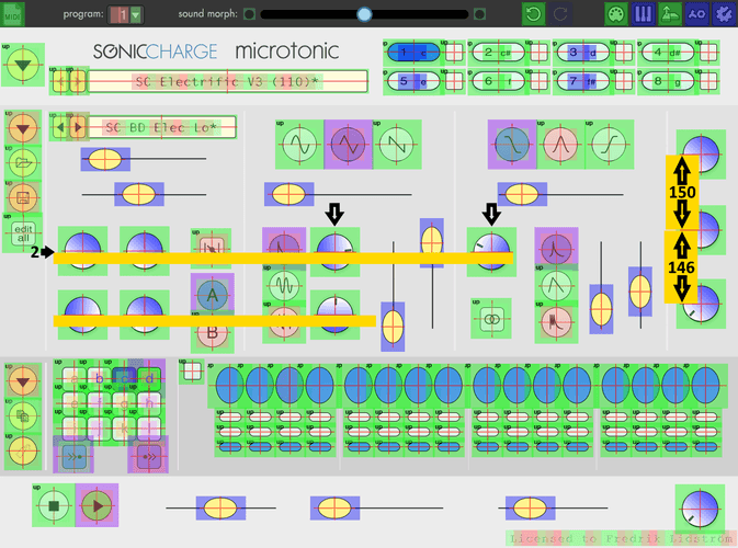
I'm not sure, however, whether the master knob should also be moved 2 pixels to the right (to be in line with the three knobs in the VEL section). What do you think?
Fredrik Lidström
Thank you for pointing it out (again). This needs to be updated in the code, I should probably take a look at doing it before we make a release candidate. I am pretty sure it will not mess up the skins too much, except for maybe re-aligning some labels in the background image.
larserik
- Fredrik Lidström wrote:
Thank you for pointing it out (again). This needs to be updated in the code, I should probably take a look at doing it before we make a release candidate. I am pretty sure it will not mess up the skins too much, except for maybe re-aligning some labels in the background image.From the looks of it the knob markings and the labels in my skins needs to be adjusted, especially the velocity knobs. With some heads up I have no problem making the proper adjustments before the 13 of June.
electronic drum
Thank you, Fredrik and LarsErik!
Fredrik Lidström
Sorry guys, more upcoming changes.
Template skin is updated. If you're working on a skin, wait for the new binary. I'll try to get it sorted after the weekend. I am pushing the skin deadline two weeks forward, so you'll still have time if you want it included in the release installer.
larserik
So I did the adjustments and then I kept on going so now there lots of changes all over.
You need to be signed in to post a reply